
The MBNA Secure Banking Experience initiative aimed to elevate MBNA’s digital presence—across both responsive web and native mobile—by empowering users with intuitive security controls, seamless access, and clearer spending insights.
I co-led design and research for MBNA’s security and transactions suite, designed 7+ features, including the Lock/Unlock card feature, Biometric Login, Digital Collateral (paperless), an improved Balance Transfer flow, and a redesigned Spend Alert experience.
I designed an engaging, intuitive game dashboard for K–6 students on the TVO mPower platform, serving as a central hub to access games, track progress, and discover challenges. Initially focused on the Summer Challenges event, we identified the need to incorporate a progress tracking feature into the dashboard to boost engagement year-round, which led to a redesign of the dashboard itself.
I envisioned and built a streamlined site where decision-makers (e.g., school administrators, continuing education directors) could quickly understand TVO ILC’s blended-learning programs, read client testimonials, and—most importantly—fill out an optimized contact form I designed and integrated directly into the sales CRM. By housing program details, accreditation highlights, and partner success stories in one location—and by personally fine-tuning that multi-step form flow—the Global Partners site positions TVO ILC as a credible, scalable provider of distance-education solutions.
Product Overview
Product Overview
Product Overview
Product Overview
Our objective was to introduce a Fractional Shares feature across both platforms, allowing users to invest in fractions of a share. This new functionality addresses the growing demand for flexible investment options—enabling users to diversify their portfolios without committing to full share purchases. The goal was to create a best-in-class fractional trading experience by lowering the barriers to trading high value stocks/ETFs, while helping investors confidently create the investment portfolio they want.
Project Overview
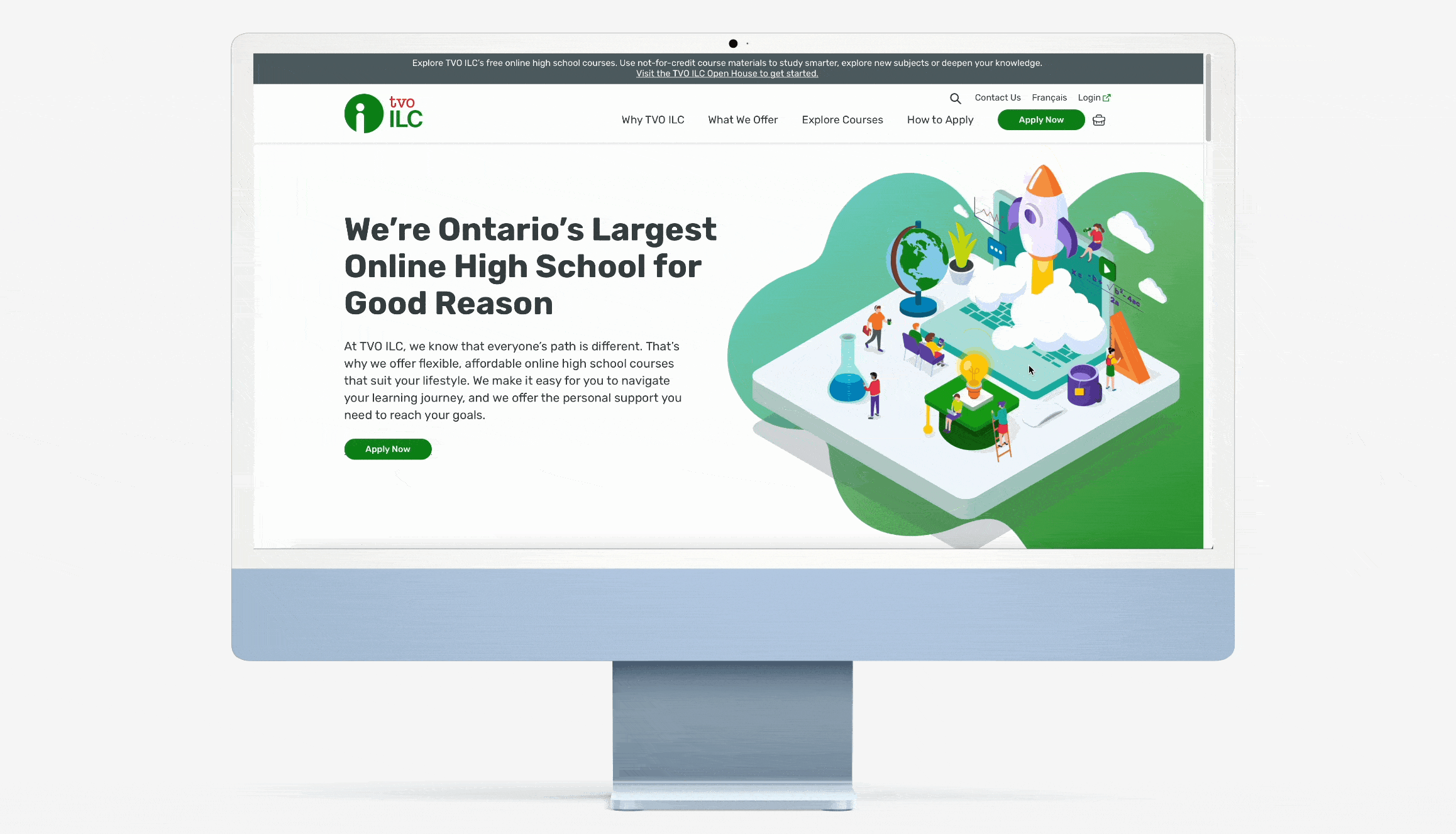
When TVO ILC set out to create a smoother, more engaging experience, I knew this was a chance to make a real impact. The platform was ready for an update—not just a facelift, but a thoughtful redesign that also introduced a new online payment feature for course application fees. This feature was essential in making the payment process seamless, ensuring that students could easily enroll in courses without any hassle. Working on this project allowed me to blend creativity with practicality, turning complex challenges into simple, user-friendly solutions.
MBNA, a credit card product of TD Bank, offers secure and convenient credit solutions. The MBNA Secure Site is a protected online platform where users can manage accounts, track transactions, and make payments, ensuring a seamless and secure banking experience.
WebBroker is TD’s comprehensive online trading platform that makes investing accessible by offering real-time market data, research tools, and portfolio management. Meanwhile, TD Easy Trade is designed as a simplified, user-friendly interface for everyday investors. Together, they empower users to buy and sell stocks, ETFs, options, and mutual funds.
When homework battles and disengaged classrooms became the norm, TVO answered with TVOlearn—a free, digital platform revolutionizing Ontario’s K-12 curriculum into interactive quests. Imagine algebra reimagined as a puzzle to solve, history unfolding as a time-travel adventure, and science experiments that spark genuine “Whoa!” moments. TVOlearn isn’t just a tool—it’s an invitation to experience education in a whole new, immersive way.
In this project, I expanded TVOlearn by adding a Kindergarten course preview and integrating Kindergarten into the main navigation at www.tvolearn.com. Key contributions included:
• User-Centered Discovery: Engaged with parents and educators to tailor the design for young learners and families.
• Intuitive Design: Created a dedicated entry point with playful, accessible elements for early learning.
• Seamless Integration: Ensured the new section blended effortlessly with the existing curriculum, enhancing overall engagement.
• This integration reinforces TVOlearn's commitment to transforming education into an accessible, delightful adventure for every family.
Project Overview
Project Overview
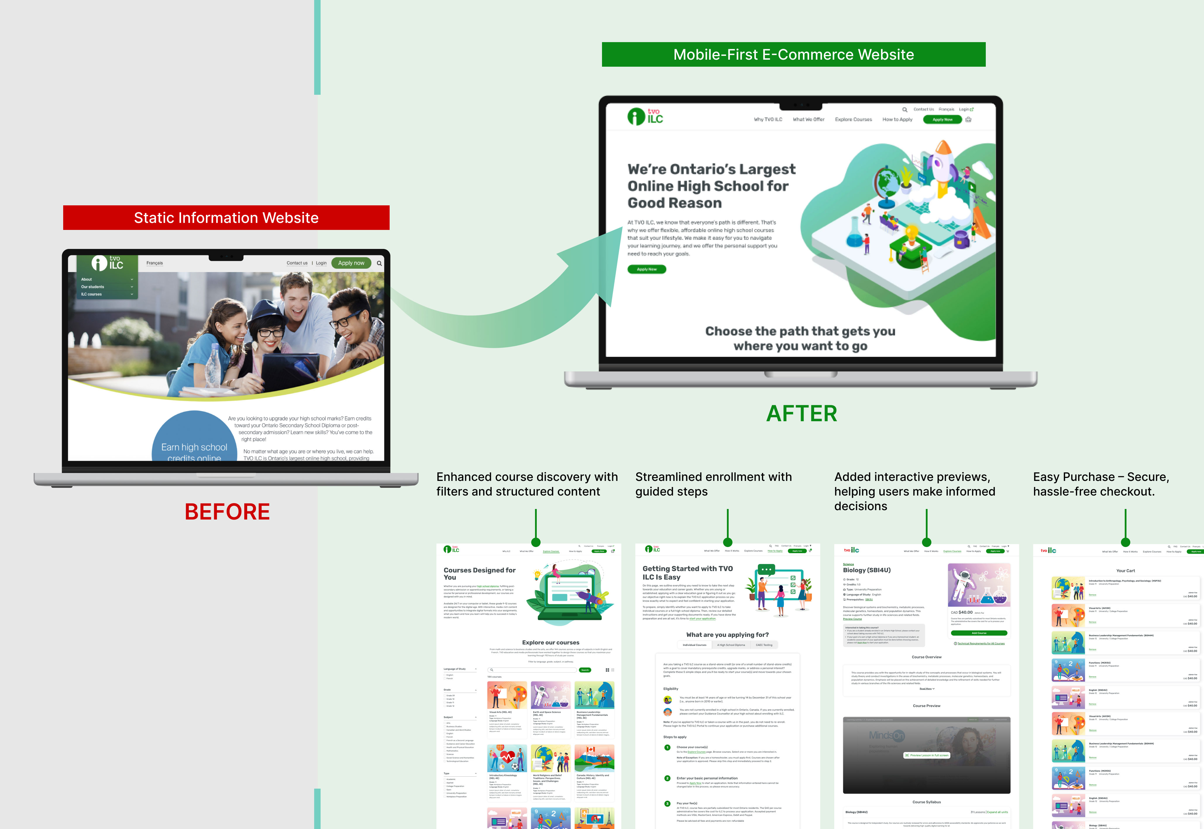
This project took TVO ILC from a static marketing site to a 0→1 self‑serve e‑commerce platform. I led the end‑to‑end design effort—from stakeholder workshops and user research to launch—by:
• Reimagining the checkout flow and streamlining the multi‑step application journey.
• Crafting a new visual language that aligns with TVO’s brand and unifies the user experience.
• Building a scalable design system for consistent UI and rapid iteration.
Define the Problem
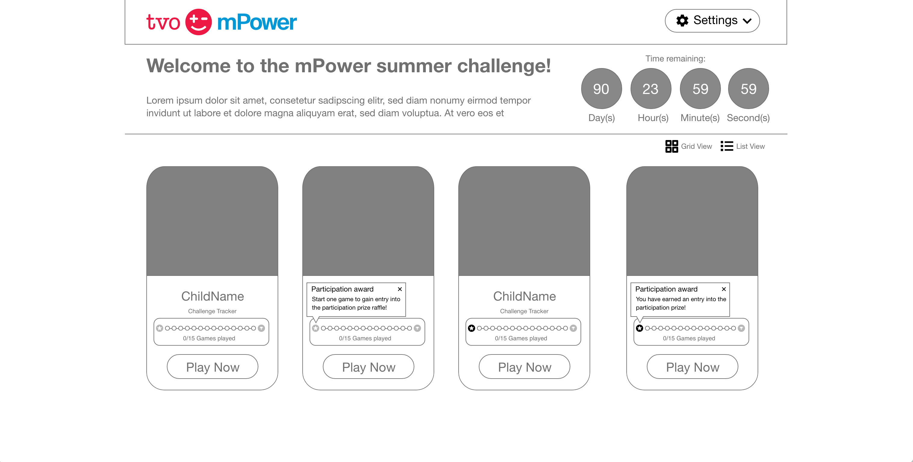
The original mPower dashboard lacked personality and clarity. It wasn’t built with young learners in mind—colors were muted, navigation was generic, and key elements like progress were missing.
Engagement during the Summer Challenge event was also low. There was no clear visual reward system, and without integrated progress tracking, students had little motivation to stay involved. These gaps presented an opportunity to rethink how we encouraged learning through fun and structure.
Research & Insights
We kicked off with a collaborative workshop to map out user journeys for students, teachers, and parents. These flows helped clarify the needs of each group and framed our prioritization—for example, emphasizing independence for students and clarity for teachers.
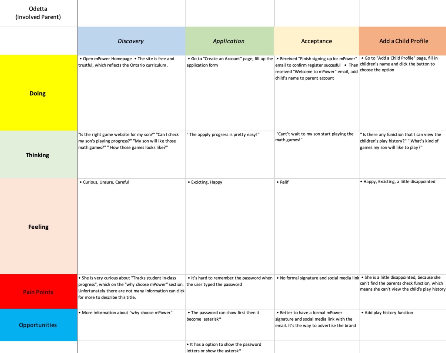
Partial of User Journey
To better understand the needs of young learners and educators, we conducted our own research by analyzing platform usage data and gathering direct feedback from teachers.Key insights included:
• Students struggled to recognize their progress and often lost motivation.
• Teachers needed a more structured way to monitor classroom activity.
• Visual rewards and countdowns significantly helped sustain engagement.
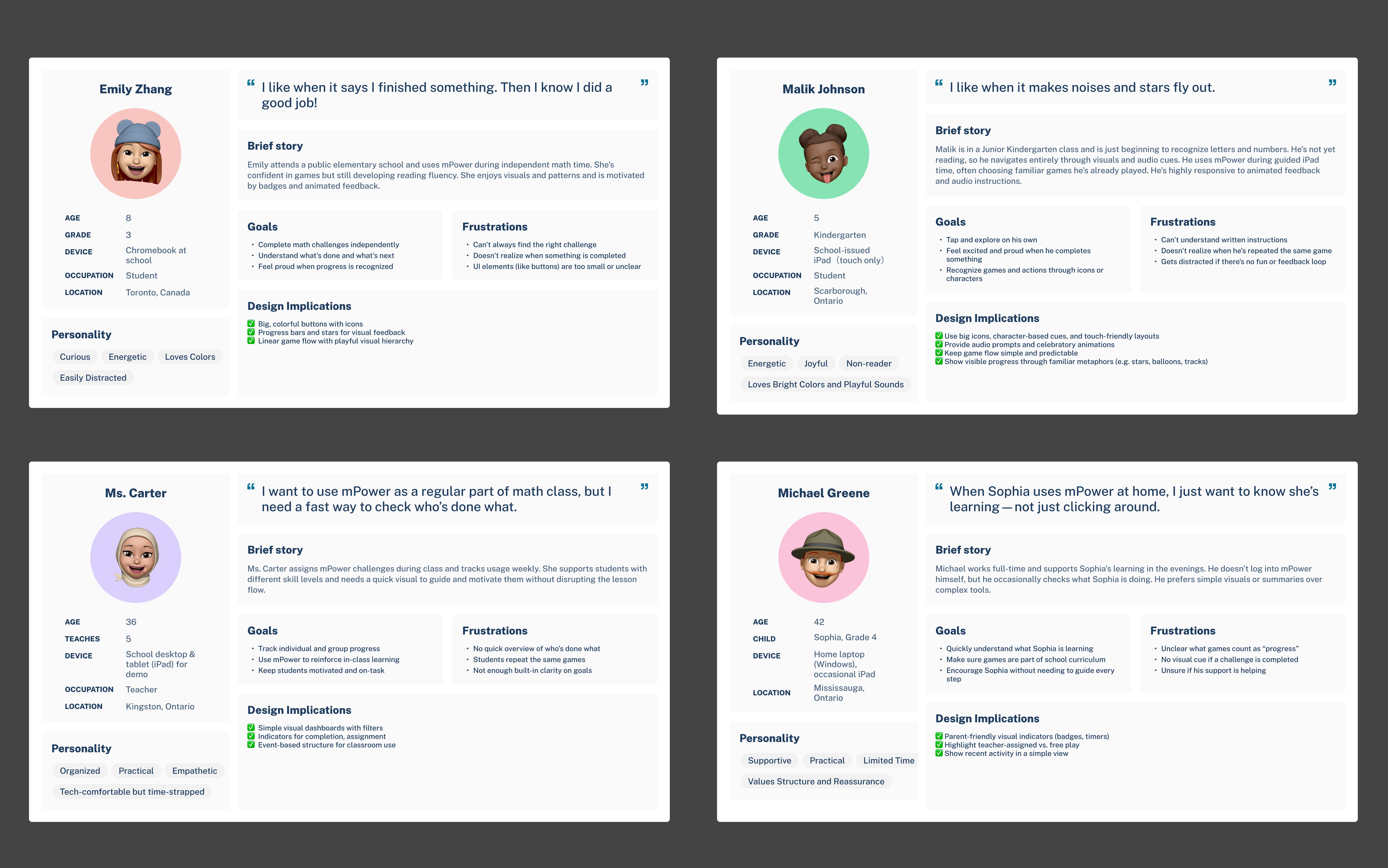
User Persona
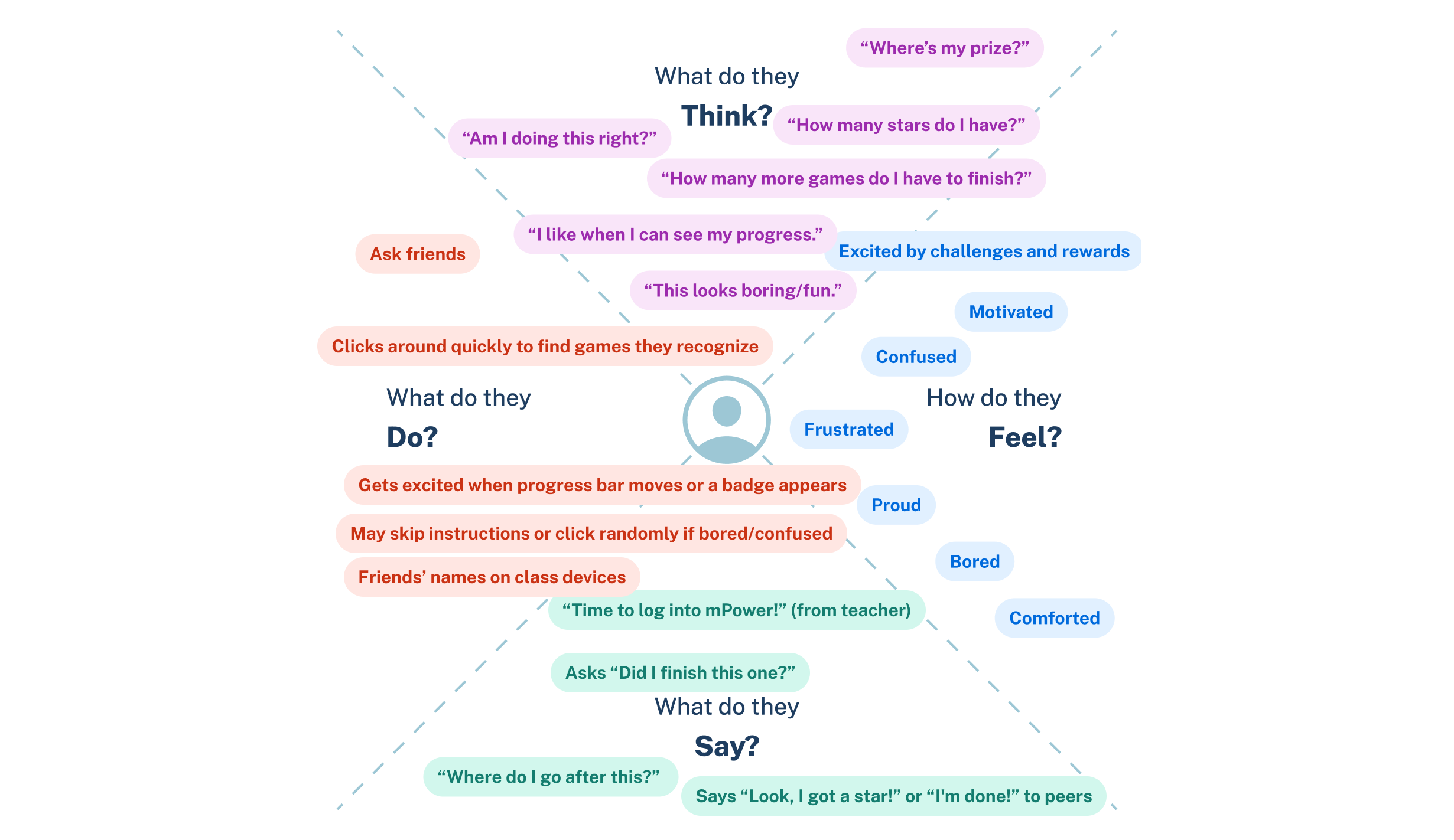
Empathy Map
Outcome
In just six weeks, the site brought in over 200 contact form submissions. Visitors from 12 countries outside Canada confirmed the site’s global appeal and positioned TVO ILC as a trusted international education provider.
Wireframing & Early Concept Development
Based on these insights, I created low-fidelity wireframes to explore layout ideas and define how Summer Challenges would live within the main dashboard.
Key features introduced: a prominent event banner, game achievement bars, and more personalized user elements.

The Problem
• No Central Hub: Prospective institutional partners saw only generic TVO pages or PDF collateral.
• Fragmented Lead Capture: Emails and phone calls created inconsistent data, making follow-up slow and error-prone.
• Low Conversion Potential: Without a dedicated “partner” experience, most visitors left without submitting inquiries, limiting new partnership opportunities.
Our challenge was to create a streamlined, credible digital touchpoint for global institutions—within six weeks and a limited budget.
My Design Approach
Stakeholder Workshops
I collaborated with Sales Managers and VPs to understand the existing B2C flow and identify gaps for institutional users. We mapped the current partner onboarding process—which was heavily manual—and identified three key needs:
• Clear, trustworthy content tailored to institutional goals.
• A fast way to validate credibility (accreditation, success stories).
• A frictionless, trackable contact flow.

Visual Exploration
To ensure global relevance, I analyzed international education and B2B platforms—focusing on color psychology, typography, and layout patterns across cultures. These insights shaped a design direction that balanced universal usability with TVOILC’s brand identity. The result was a clean, credible, and culturally adaptable interface that built trust with decision-makers across global markets.

Crafting the Visual Experience
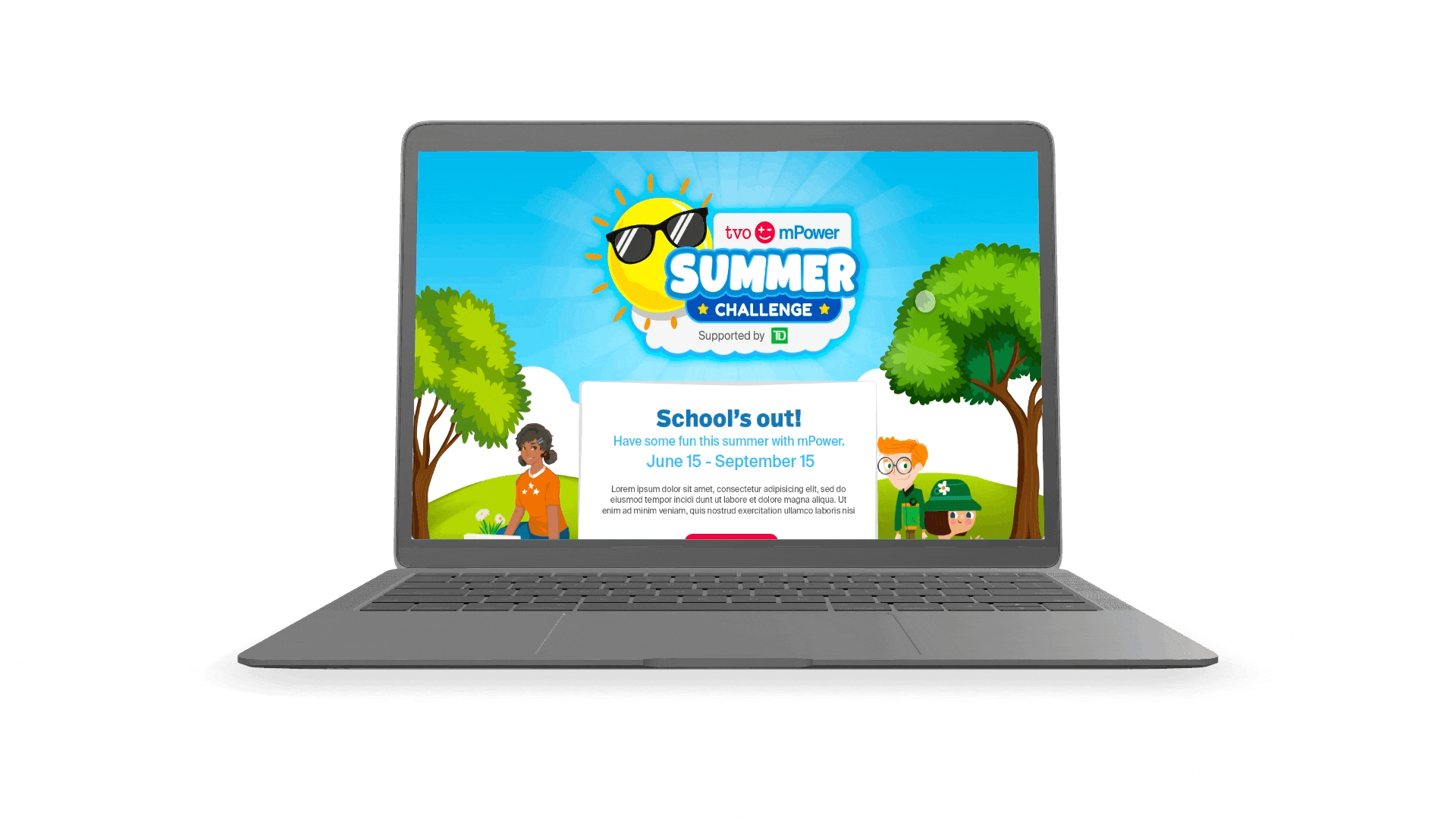
I designed a dedicated section for the Summer Challenge with a bold visual banner, a countdown timer to drive urgency, and a gamified progress bar on each name card. I tested multiple visual styles and color palettes to ensure accessibility, validating contrast with WebAIM standards.
Summer Challenge Landing Page
Optimized Contact Form
As the primary conversion driver, the contact form was strategically placed at the top of the page for maximum visibility. I designed it as a multi-step form to reduce cognitive load and improve completion rates.It captured key business data—such as organization name, country, and contact email—and was fully integrated into the sales CRM, ensuring leads were captured cleanly and followed up promptly without manual delays.

Content-Driven Interaction Design
To build trust and clearly communicate value, I crafted content specifically for decision-makers in education—focusing on accreditation, program outcomes, and partner success stories.
I paired this with thoughtful scroll-based interactions and custom illustrations to guide attention, create moments of delight, and maintain engagement throughout the page. The result was a user experience that felt credible, modern, and purpose-built for global institutional audiences.

TVO ILC'S Values

Global Student Map
Results
Despite tight constraints, we successfully launched the Global Partner site in just six weeks. The impact was immediate: over 200 qualified contact submissions came in within weeks, with visitors from 12+ countries confirming global relevance. The site also empowered the Sales team with structured, actionable lead data, and positioned TVO ILC as a credible international education provider ready to scale.

Project Overview
In this project, I expanded TVOlearn by adding a Kindergarten course preview and integrating Kindergarten into the main navigation at www.tvolearn.com. Key contributions included:• User-Centered Discovery: Engaged with parents and educators to tailor the design for young learners and families.• Intuitive Design: Created a dedicated entry point with playful, accessible elements for early learning.• Seamless Integration: Ensured the new section blended effortlessly with the existing curriculum, enhancing overall engagement.• This integration reinforces TVOlearn's commitment to transforming education into an accessible, delightful adventure for every family.
Project Overview
Our objective was to introduce a Fractional Shares feature across both platforms, allowing users to invest in fractions of a share. This new functionality addresses the growing demand for flexible investment options—enabling users to diversify their portfolios without committing to full share purchases. The goal was to create a best-in-class fractional trading experience by lowering the barriers to trading high value stocks/ETFs, while helping investors confidently create the investment portfolio they want.
Project Overview
The goal was clear: transform the digital banking experience into one that is not only seamless and secure but also deeply intuitive and reliable. To do this, we set out with key objectives:
• Building Trust: Crafting an experience where users feel safe managing their finances online.
• Improving User Experience: Simplifying interactions and creating a platform that’s accessible for all users.
• Developing an Internal Design System: Establishing a cohesive set of design patterns to streamline collaboration and ensure consistency across future updates.
• Supporting Business Growth: Enhancing customer satisfaction and engagement to drive the continued growth of MBNA’s digital services.
The goal was clear: transform the digital banking experience into one that is not only seamless and secure but also deeply intuitive and reliable. To do this, we set out with key objectives:
• Building Trust: Crafting an experience where users feel safe managing their finances online.
• Improving User Experience: Simplifying interactions and creating a platform that’s accessible for all users.
• Developing an Internal Design System: Establishing a cohesive set of design patterns to streamline collaboration and ensure consistency across future updates.
• Supporting Business Growth: Enhancing customer satisfaction and engagement to drive the continued growth of MBNA’s digital services.Project OverviewMBNA, a credit card product of TD Bank, offers secure and convenient credit solutions. The MBNA Secure Site is a protected online platform where users can manage accounts, track transactions, and make payments, ensuring a seamless and secure banking experience.
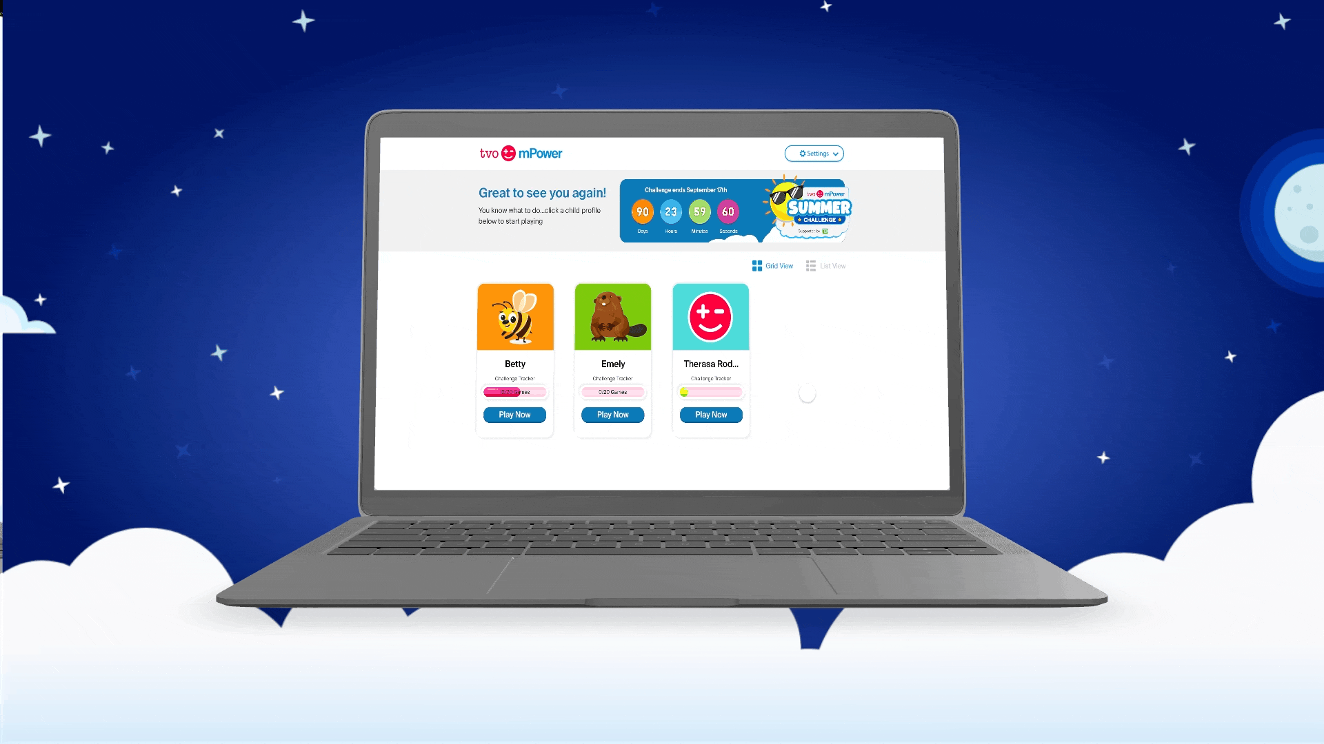
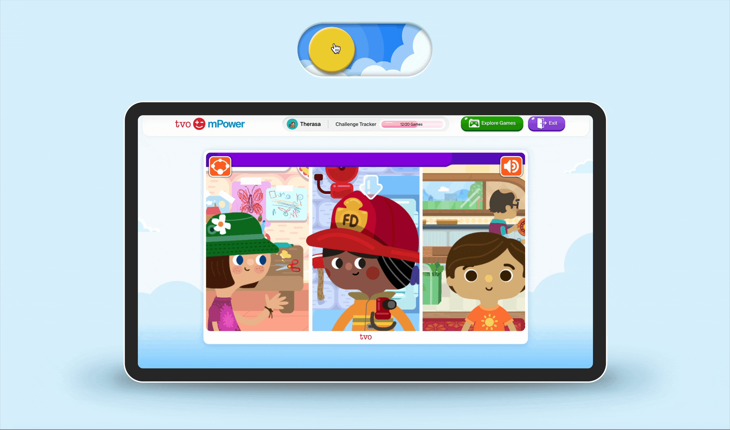
Reimagined the top navigation to be more personal and kid-friendly, adding the student’s name, progress feedback, and playful icons. Simplified core actions like "Explore Games" and exit for better clarity. Introduced dynamic backgrounds that adapt to light and dark modes to enhance comfort and visual engagement.
Game Dashboard Redesign
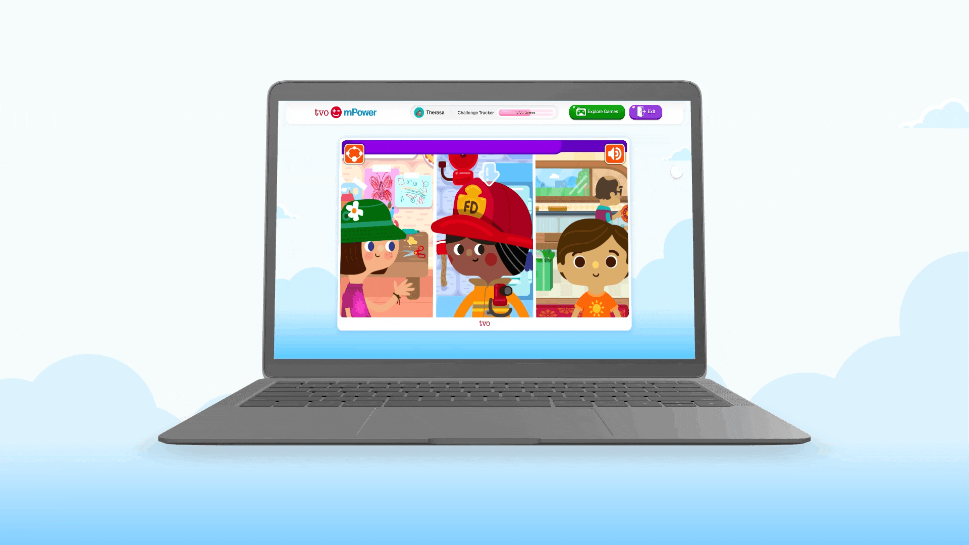
Game Dashboard — Auto Light/Dark Mode
To make the experience feel more like a game and less like a dashboard, I added an auto light/dark mode that shifts with time or system settings.When students play during the day, the interface feels bright and energetic.
At night, it transitions into a darker, more immersive theme — reducing eye strain and matching the mood of the game.This small touch helped:
• Create a more playful, atmospheric UI
• Align the dashboard with real game environments
• Improve comfort for longer sessions
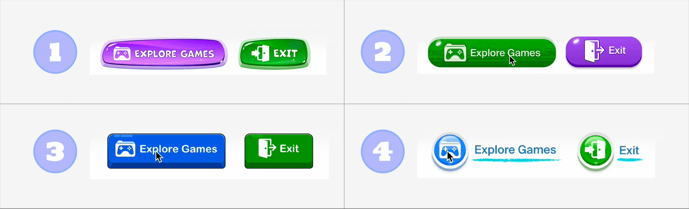
Game Button Variations & A/B Testing
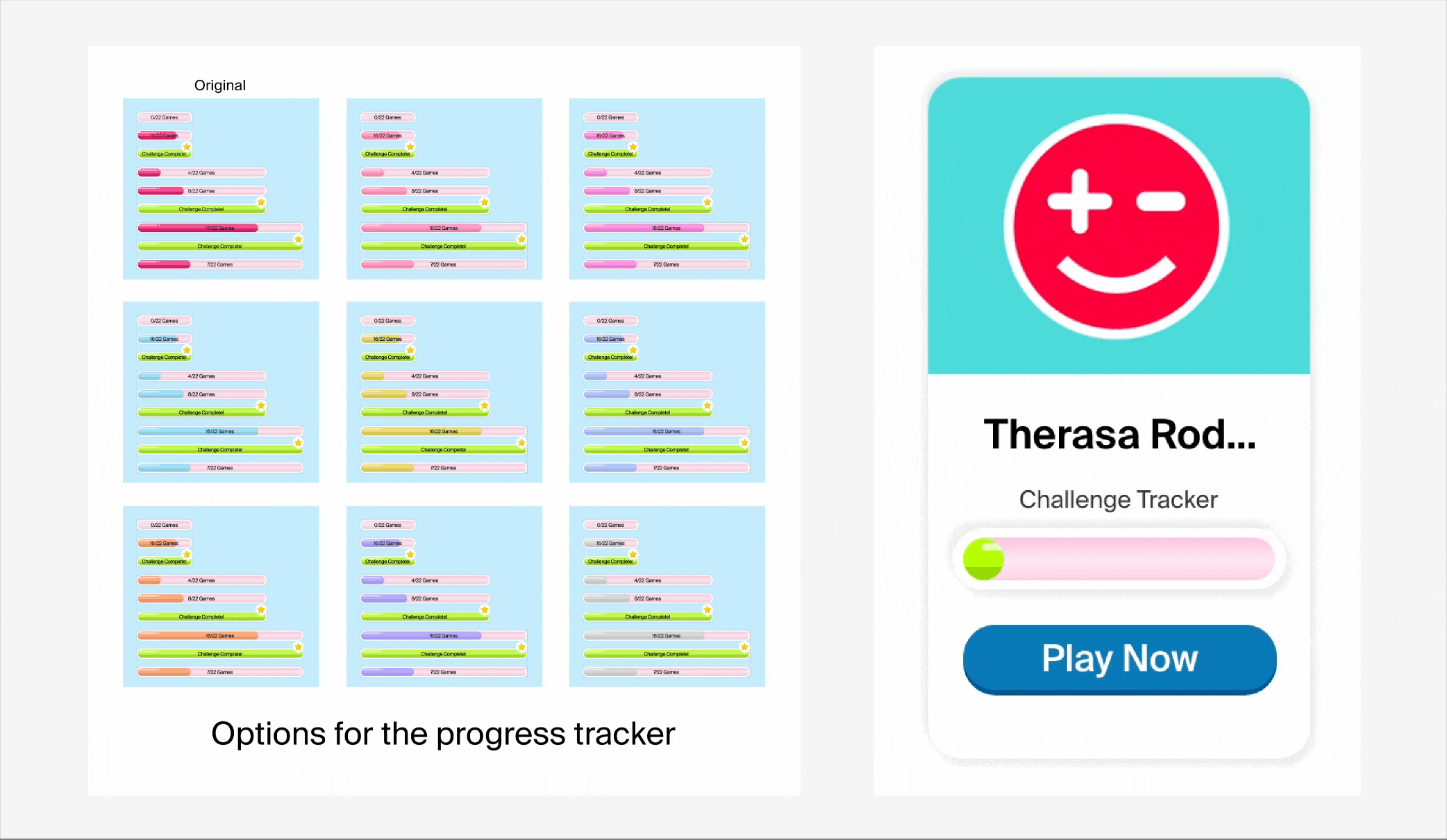
Designed 4 game button styles and conducted internal A/B testing. Version 2 was selected due to higher engagement and better alignment with the platform’s visual language. Its rounded shape tested better with students and was easier to implement technically.
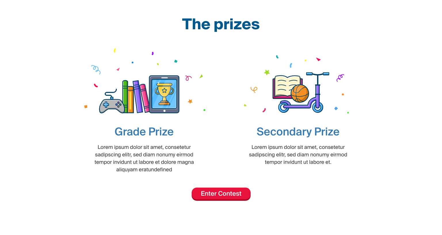
Prizes Illustration Design
Collaborated with another designer to build the external Summer Challenge info page. I led the illustration work for the prize section—designing colorful, playful visuals that clearly conveyed reward value and sparked excitement.
Outcome & Learnings
• Increased engagement: The new dashboard layout and challenge design led to improved interaction rates during the event.
• Positive feedback from educators who appreciated the added clarity and structure.
• Created design patterns now being reused in other areas of the mPower platform.
Key takeaway: A small shift in visual feedback and motivation cues can dramatically influence young learners’ willingness to engage and explore. Balancing fun with clarity was critical in creating an experience that felt both playful and purposeful.

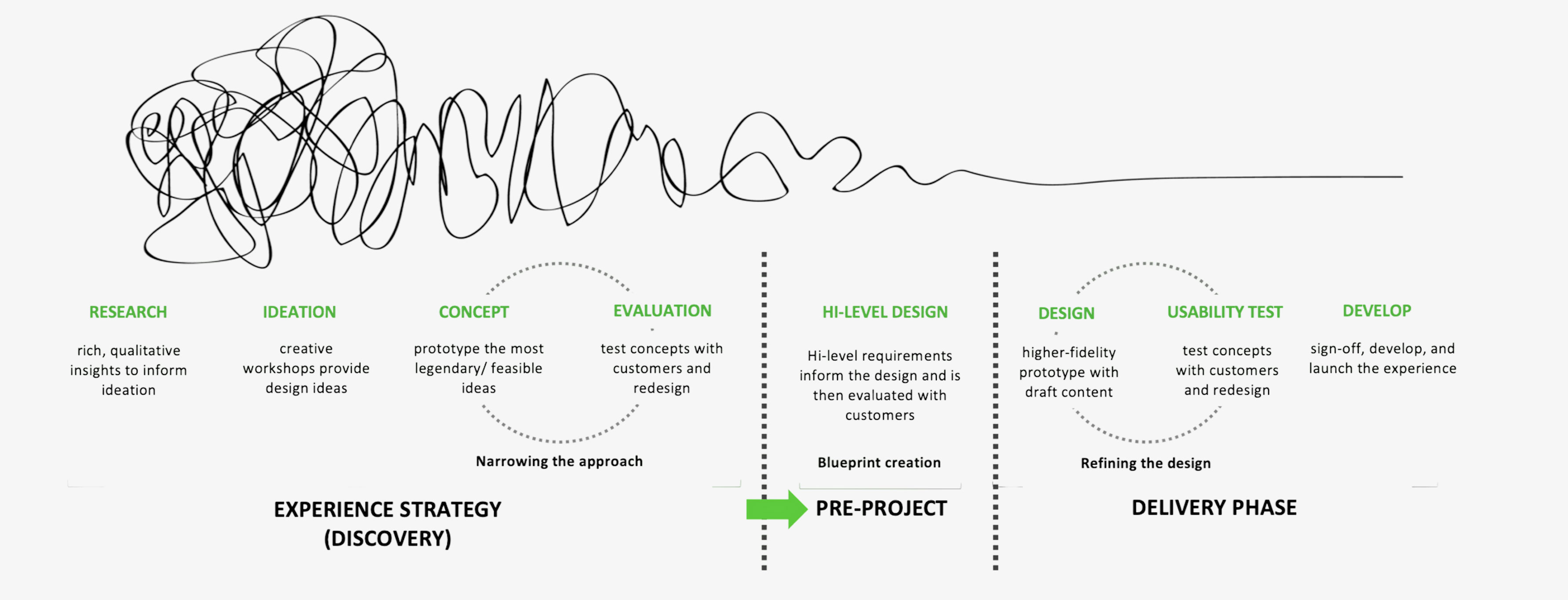
After joining the product, we kicked off our work by defining a clear design process that aligns four key disciplines(see image below). Our process is agile by nature—a flexible roadmap that adapts to the complexity of each feature and evolving stakeholder needs.


To design a solution that truly resonated with MBNA’s diverse customer base, we first established a strategic user segmentation framework. This matrix categorized users into four key segments—Credit Optimizers, Travel Enthusiasts, Credit Newbies, and Small Business Owners—based on their financial behaviors, digital maturity, and core banking needs.

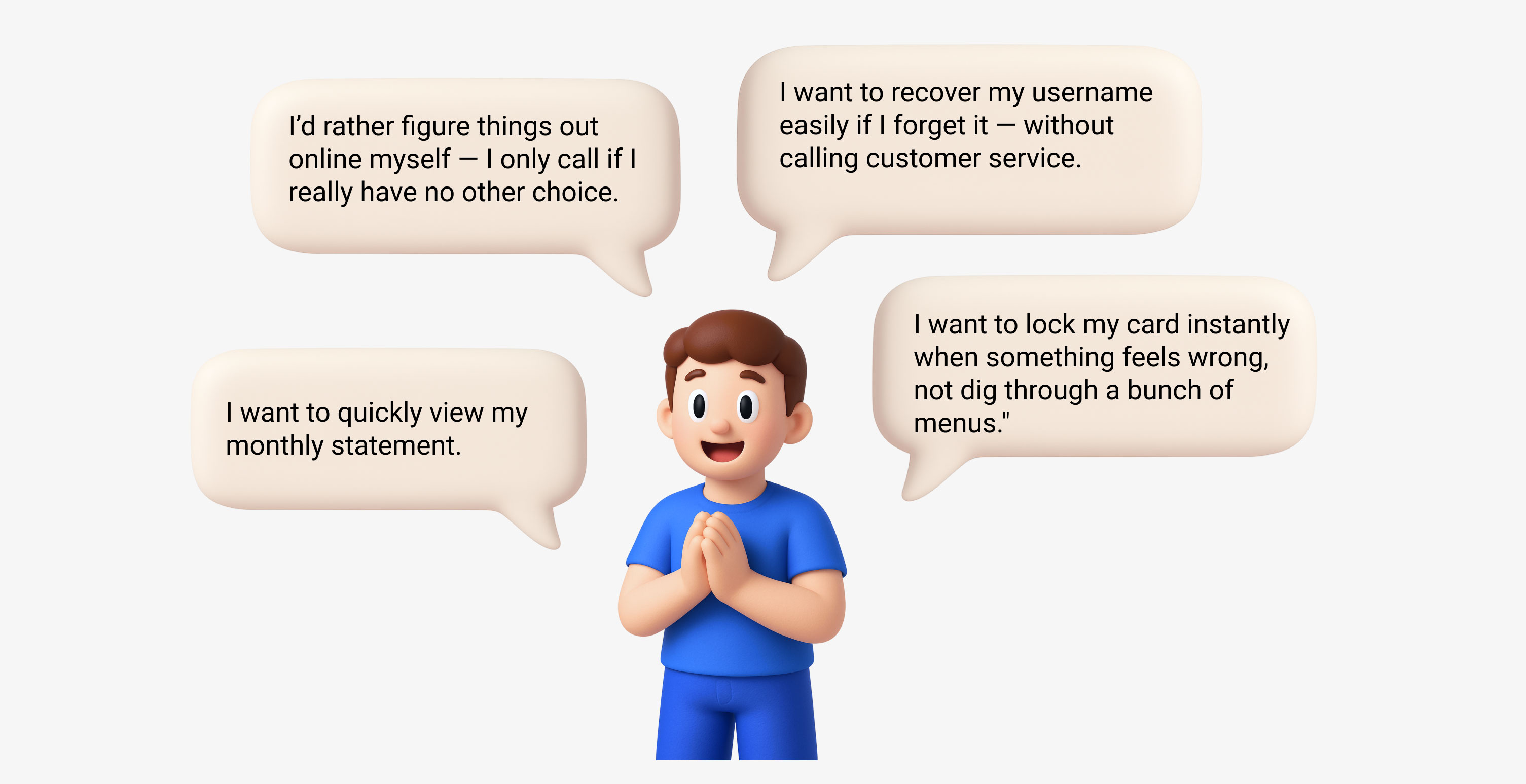
To turn our research into action, I facilitated a workshop with the PM to map user pain points onto an Impact vs. Effort matrix. Before that, we validated each opportunity using support call data, login failure rates, and feature analytics.
• “How do I freeze my card?” made up 25% of fraud-related calls
• 12% of mobile logins failed, often leading to app abandonment.
We explored ideas like card lock, budget alerts, and filtering, but prioritized solutions with high impact and strong stakeholder alignment to ensure a feasible launch path.

To ground our priorities in real user needs, I collaborated closely with a UX researcher to conduct 16 in-depth interviews with MBNA cardholders representing a range of life stages and usage behaviors. Our goal was to validate early assumptions from segmentation and analytics, and to understand the end-to-end digital experience from the user’s perspective.
These insights directly informed our Impact vs. Effort prioritization, helping us focus on the most valuable opportunities backed by real user pain points.

Lock/ Unlock Feature
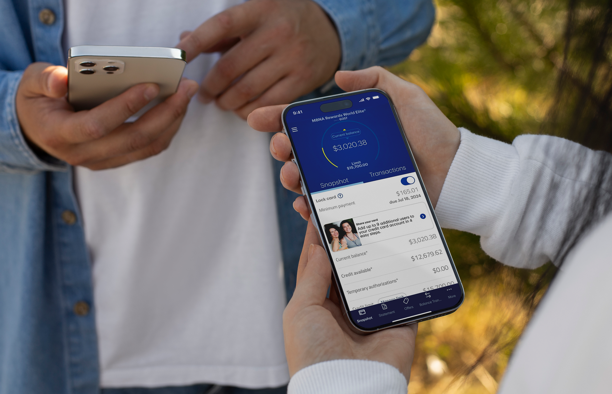
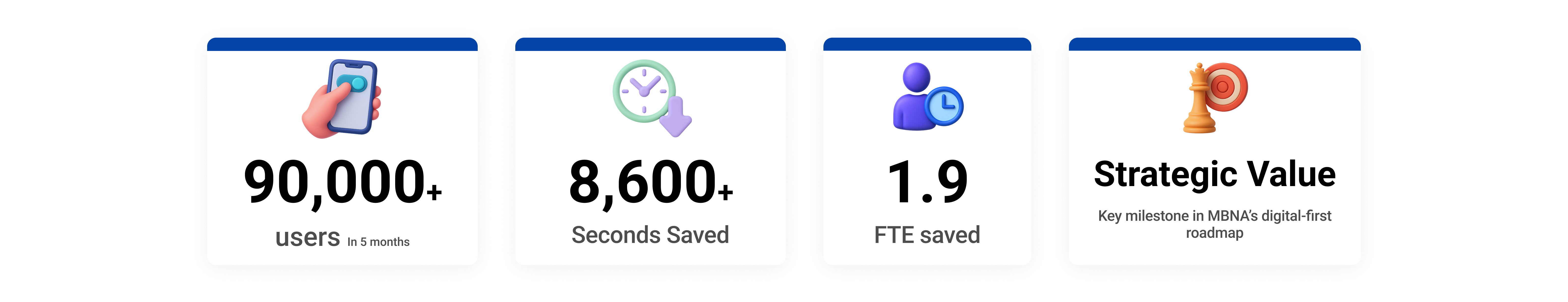
Problems
When users spotted unfamiliar charges, locking their card was urgent—but the process was slow and frustrating. The feature was buried deep, required lengthy forms or phone calls, and offered no immediate confirmation. This unclear, high-stress experience led to a surge in support calls, overwhelming customer service and increasing operational costs.
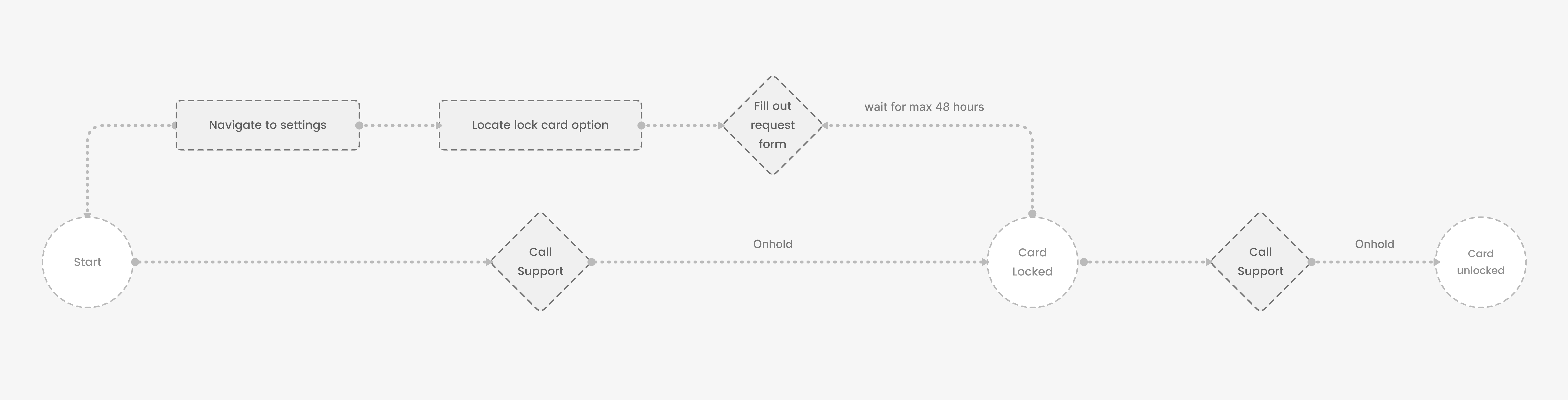

Design Solutions
We reimagined the card locking experience to be fast, intuitive, and reassuring—built around moments of urgency and user control.


Biometrics Login

Problems
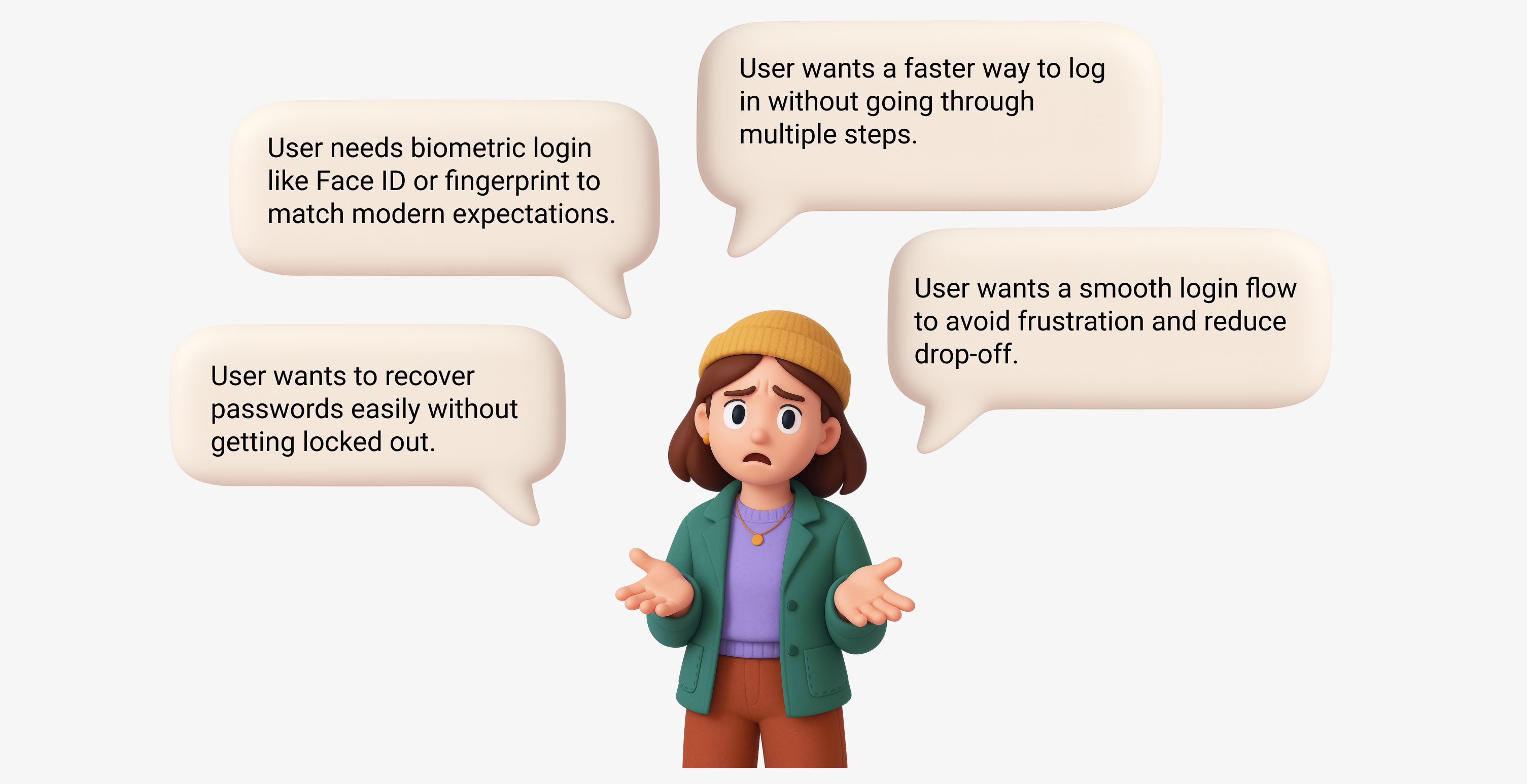
Based on our Competitor Audit Table and discovery interviews, many users expressed frustration with the multi-step login process—especially when they had to reset passwords or couldn’t access their accounts quickly.
Market Scan: Biometric Login Best Practices
To understand how MBNA Secure Site could stand out, we analyzed biometric login implementations across seven leading banking apps (TD, RBC, BMO, CIBC, Capital One, American Express, and our own MBNA). Our audit covered everything from enrollment flows and UI feedback to fallback strategies, device compatibility, and support mechanisms.


Design Challenge
How might we deliver a faster, secure, and seamless login experience for returning users—while navigating tight development timelines, integrating with legacy authentication systems, and working within the constraints of an external SDK that limits UI customization?
Auditing the Competition, Mapping the Friction


Design Solution
We introduced a “What’s New” page after login to highlight the new biometric feature—explaining its speed, security, and convenience with simple language and visuals.

Right after, users are guided through biometric setup as part of onboarding. The flow is:
• Optional but visible, respecting user control
• Device-aware, showing Face ID or Fingerprint based on platform
• Lightweight, with minimal steps to reduce drop-off
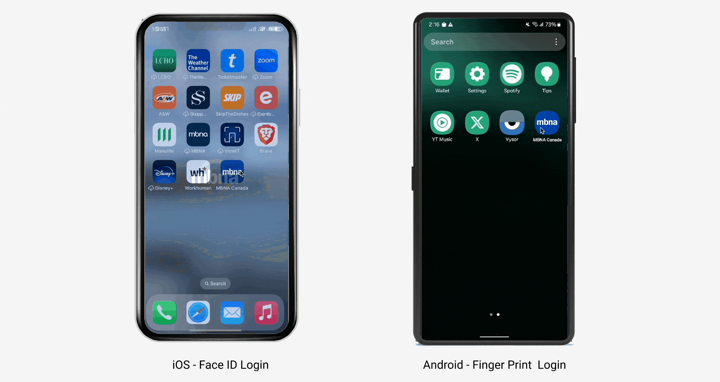
Frictionless Biometric Login Experience
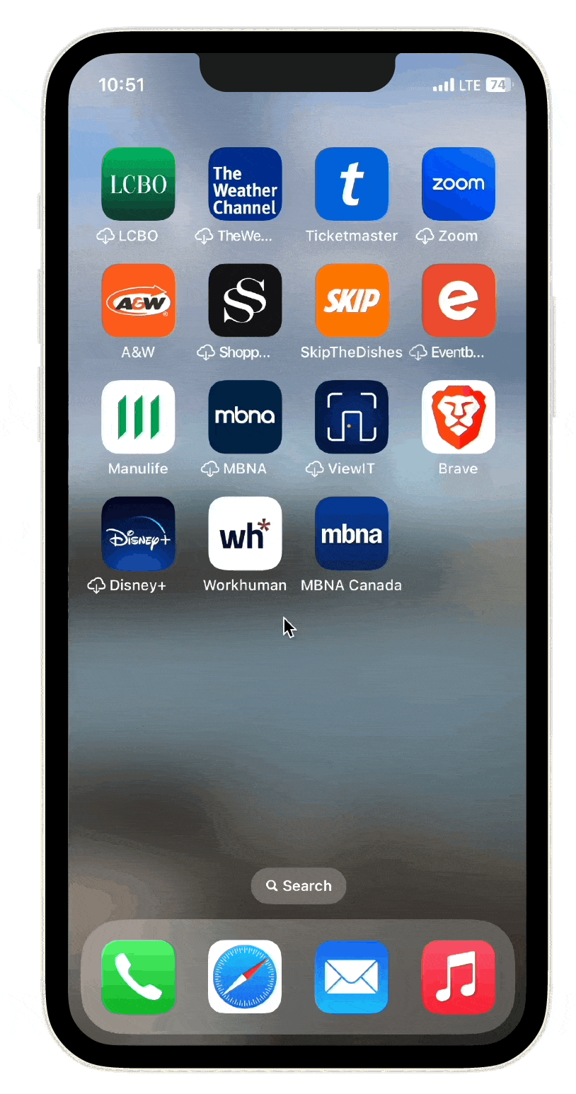
Once enabled, users see a biometric login option prominently on the login screen, with platform-specific icons and fast, secure authentication (typically under 1 second).
Project Overview
In this project, I expanded TVOlearn by adding a Kindergarten course preview and integrating Kindergarten into the main navigation at www.tvolearn.com. Key contributions included:• User-Centered Discovery: Engaged with parents and educators to tailor the design for young learners and families.• Intuitive Design: Created a dedicated entry point with playful, accessible elements for early learning.• Seamless Integration: Ensured the new section blended effortlessly with the existing curriculum, enhancing overall engagement.• This integration reinforces TVOlearn's commitment to transforming education into an accessible, delightful adventure for every family.
Problem
TVOlearn originally served grades 1-12, delivering a transformative digital curriculum for older students. However, this focus inadvertently left a gap in resources for our youngest learners. Without a dedicated Kindergarten course, families and educators lacked a tailored, engaging entry point into interactive learning during those crucial early years. This gap not only limited early exposure to digital learning but also missed an opportunity to spark curiosity and wonder, essential to a lifelong love of learning.
Ideation & Site Mapping
To effectively integrate the new Kindergarten category, I conducted a card sorting exercise to test two possible navigation structures—sorting courses by grade vs. by subject. This process allowed us to determine the most intuitive way for users to navigate and discover Kindergarten content within the existing framework of TVOlearn.
With insights from card sorting, I developed a refined site architecture to seamlessly integrate Kindergarten while maintaining a structured, user-friendly experience. The updated navigation ensures that parents and educators can effortlessly find and explore Kindergarten resources, creating a clear, engaging, and accessible learning journey from the very first interaction.

Card Sorting and Site Architecture
Optimizing the Learning Journey
The Core Challenge
With our Kindergarten content ready, we faced a critical UX dilemma: How might we help 5-year-olds independently explore while giving adults quick access to curriculum-aligned resources? Traditional K-12 navigation patterns felt too rigid for play-based learning.
The Experiment: Two Pathways Tested
Option 1: Traditional Top-Nav FlowHome → [Grade Selector] → Four Frames → Resource Page✅ Familiar: Matched existing K-12 patterns
❌ Friction:Felt like "homework mode" to kids

Testing & Decision
Presented both flows to educators, parents, and product teams via interactive Figma prototypes.
Key Feedback:
• 78% preferred Option 2 for its thematic approach:
• “This feels like natural exploration, not a syllabus.” – Kindergarten Teacher
• Parents noted Option 2’s visual activity thumbnails helped kids choose independently.
Key Design Enhancements
• Added a Kindergarten Category in the Top Navigation – This ensured a clear, intuitive access point for users to begin their Kindergarten learning journey directly from the main menu.
• Introduced a Kindergarten Section on the Homepage – Featuring a prominent CTA, allowing users to discover and enter the Kindergarten experience right from the landing page.
• Designed a New Notification Bar – Positioned at the bottom of the page, this announced the availability of new Kindergarten course resources, improving visibility and user engagement.

TVOLearn Homepage

• Developed a Kindergarten Frame Selection Page – This bridge page guided users to choose a frame before previewing available course materials, ensuring a structured and intuitive flow.

Kindergarten Landing (Strand) Page
• Customized the Kindergarten Course Page – Enhanced with playful design elements in the top banner and learning activities background, making the experience fun, engaging, and age-appropriate for young learners.

Other Design Enhancements
Designed a Grade 1-12 Subject Page
• To ensure consistency across TVOlearn, I designed a Subject Page for Grades 1-12, appearing after users select a grade from the top navigation.
• Structured Learning Path – Helps users navigate subjects efficiently, aligning with the existing Kindergarten Frames Page structure.
• Seamless User Experience – Provides a clear, intuitive entry point, guiding parents and educators before accessing course materials.
• New Subject Label – Introduced a "New" tag to highlight recently launched subjects, improving visibility and engagement.

Unveiling Insights—The Post-Launch Exploration
After launching the new Kindergarten category on TVO Learn, I conducted a data-driven evaluation using Hotjar heatmaps and user behavior analytics. By analyzing click maps, scroll maps, and move maps, I uncovered valuable insights that informed key design refinements.

TVOLearn Heatmaps
Key Insights & Design Adjustments
Homepage
• Low CTA engagement (email & support webbing). → Improved visibility, refined copy, and A/B tested new button text.
Elementary & High School Course Pages
• Users struggled with navigation, leading to drop-offs. → Optimized hierarchy, repositioned key sections, and improved mobile layouts.
Resource & Learning Activity Pages
• Mobile users frustrated by unavailable learning activities. → Added clearer messaging and optimized layouts.
• High engagement but inefficient navigation. → Enhanced structure for better content discovery.
High School Course Detail Page
• Low engagement with “Explore More Courses” CTA. → Introduced a slider and improved CTA placement.
• Mobile users struggled with course lessons. → Redesigned card-based layout for better usability.

Data Conclusion Table
Marketing Campaign
To ensure parents and educators were aware of the new Kindergarten learning resources, we launched a targeted marketing campaign across multiple platforms.

Observed Impact
During the 2022-2023 school year, TVOlearn's new Kindergarten section became one of the platform's top three most visited areas, demonstrating strong product-market fit. Our user tests revealed 85% of 4-6 year olds could independently navigate to activities using the new strand-based system - validating that our play-first approach resonated with young learners.
The redesign drove meaningful adoption in classrooms across Ontario, with educators reporting weekly use of the resources in their lesson plans. We also delivered crucial accessibility wins, including:
• Voice navigation support for pre-readers
• High-contrast visual design for low-vision users
• Perhaps most rewarding were the parent testimonials we collected:"For the first time, my child asks to 'do learning' instead of watching cartoons - the animal math games feel like pure play to him."
Alignment with Human-Centered Design Process
To design the fractional share feature, we used a human-centered design process to make sure we were solving real user problems.

End to End Design Process
Redesigned the login page
While introducing biometric login, we also revamped the outdated login page based on user feedback. The redesigned version features a cleaner UI, a more intuitive flow, and an additional entry point—making the experience feel more modern, welcoming, and trustworthy from the very first touchpoint

Improving MBNA’s Transaction Experience
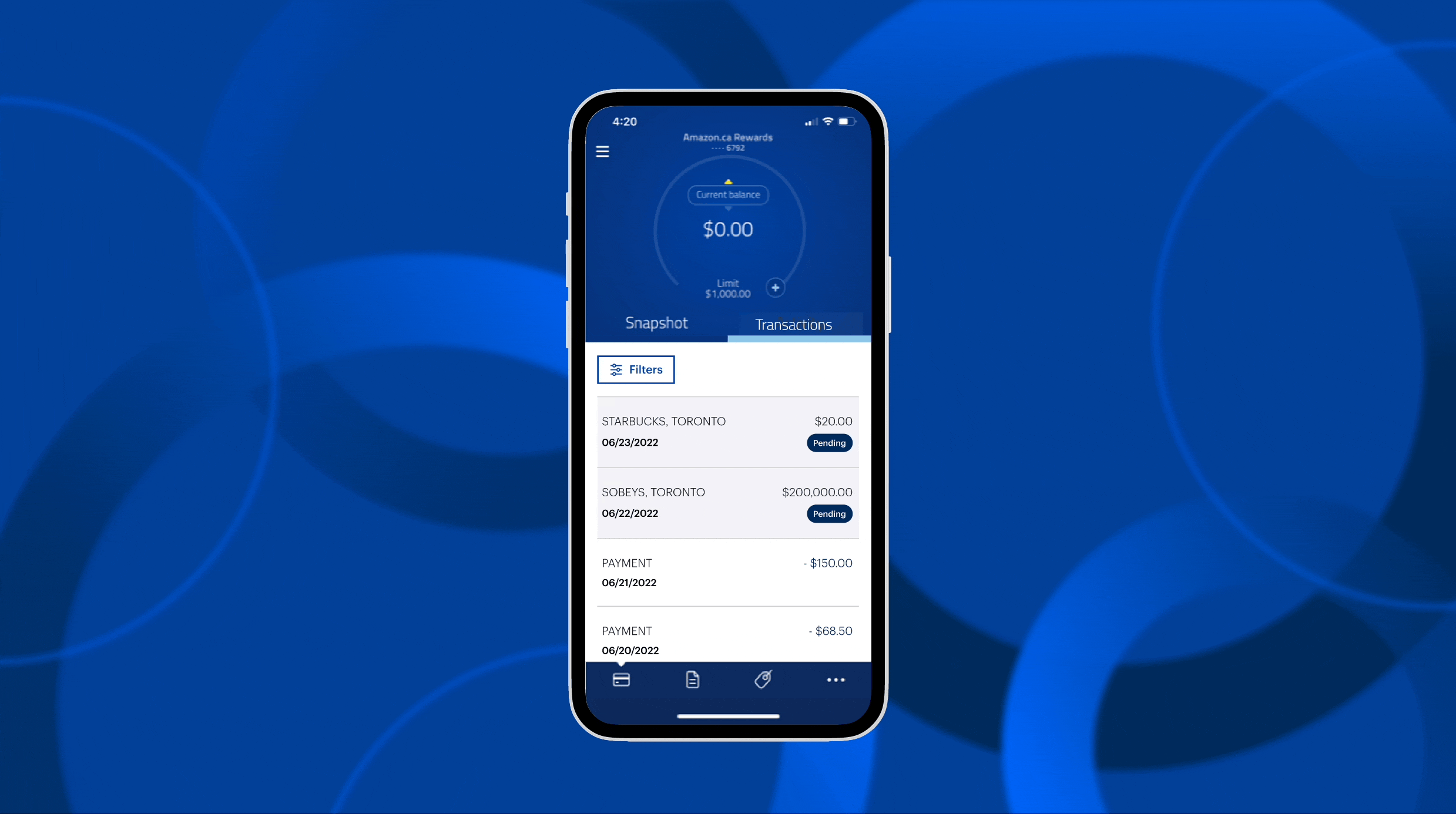
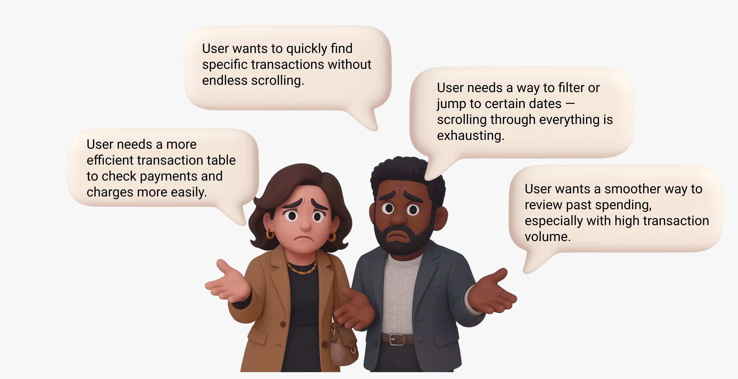
Problem
Through our discovery interviews, we identified a key friction point in the account transaction experience:users with a high volume of transactions had to scroll excessively to find specific records.
Design Opportunities from Competitor Practices
To better understand how we could improve the transaction experience, I conducted a competitor analysis focused on how other financial platforms summarize account activity.

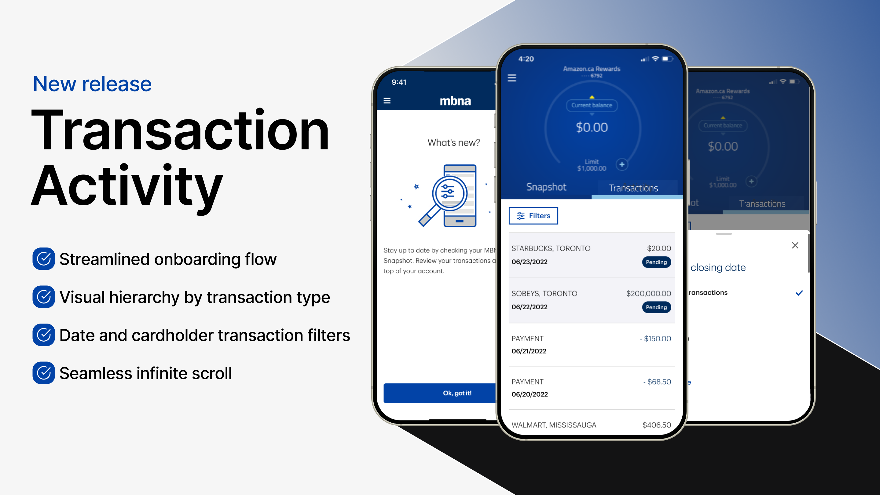
Redesigned Transaction Activity
Revamped the transaction page to better align with user intent, introducing transaction filters and ensuring a seamless experience across responsive web and native app.
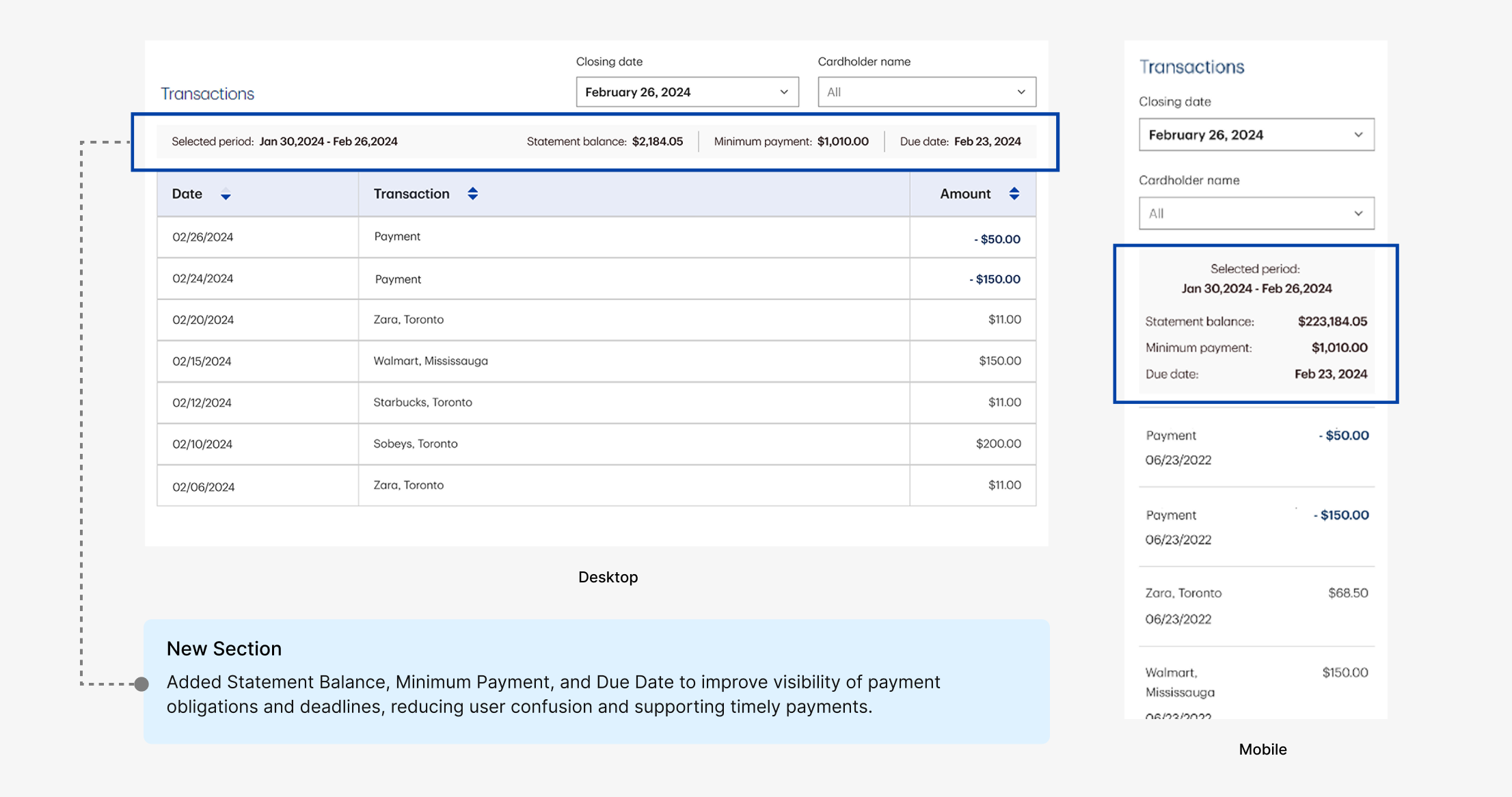
Improving the Responsive Web Experience
To create a smoother user experience, we implemented key enhancements:
Added a dedicated Balance column and an integrated Total Debit/Credit summary to the transaction table, offering users immediate financial clarity at a glance.

Building an Internal Design System

Adopting a product mindset, I built an internal MBNA design system aligned with TD’s Design System to drive consistency and efficiency across MBNA’s digital products. By auditing the global color library, I identified gaps in accuracy and accessibility. This system now serves as a solid foundation for faster, unified design iterations across future features.
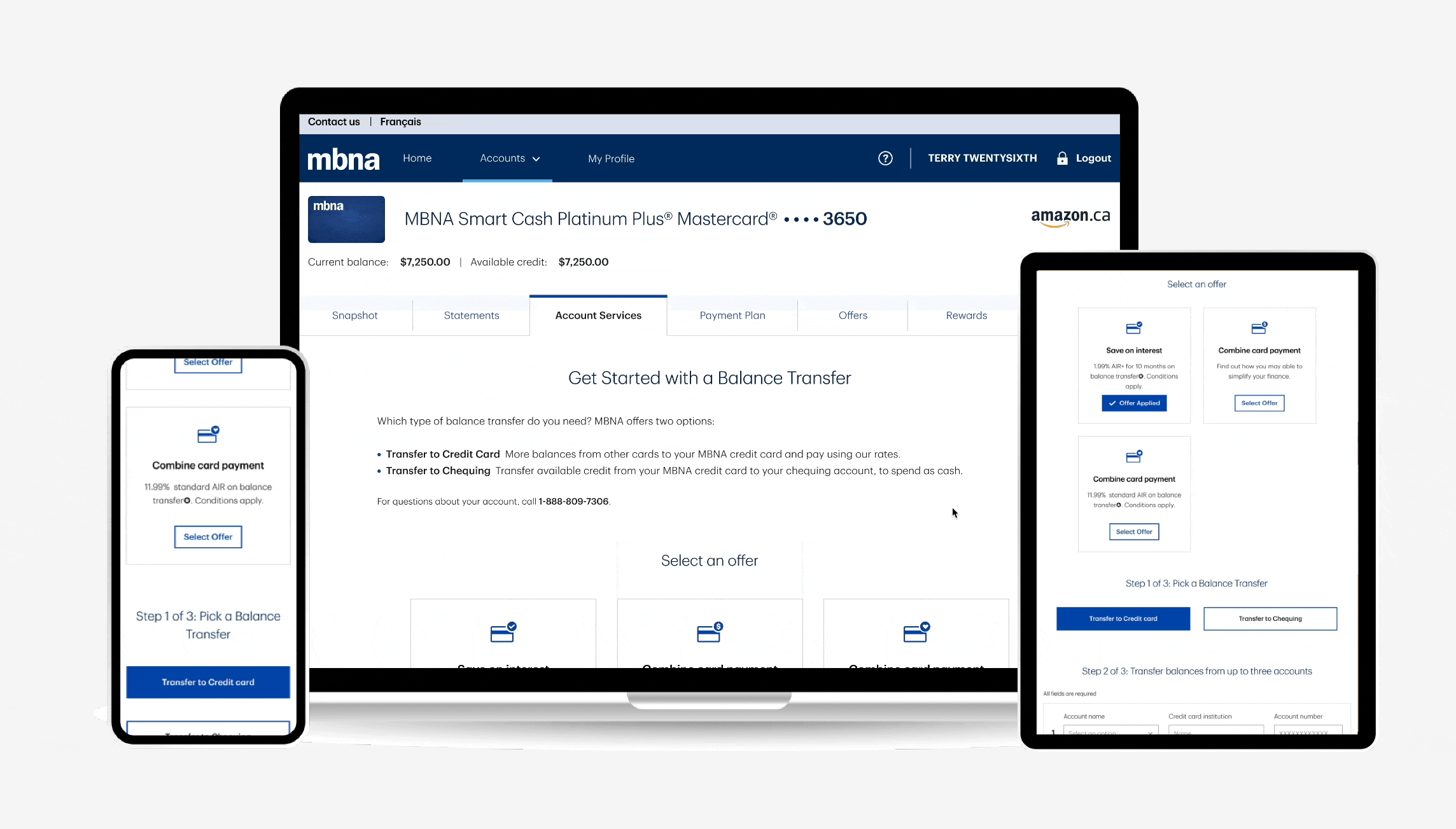
Balance Transfer
We redesigned the balance transfer flow to make it simpler and more intuitive. By reducing steps, improving clarity, and reinforcing trust through thoughtful UI, we turned a complex task into a smooth and secure experience.
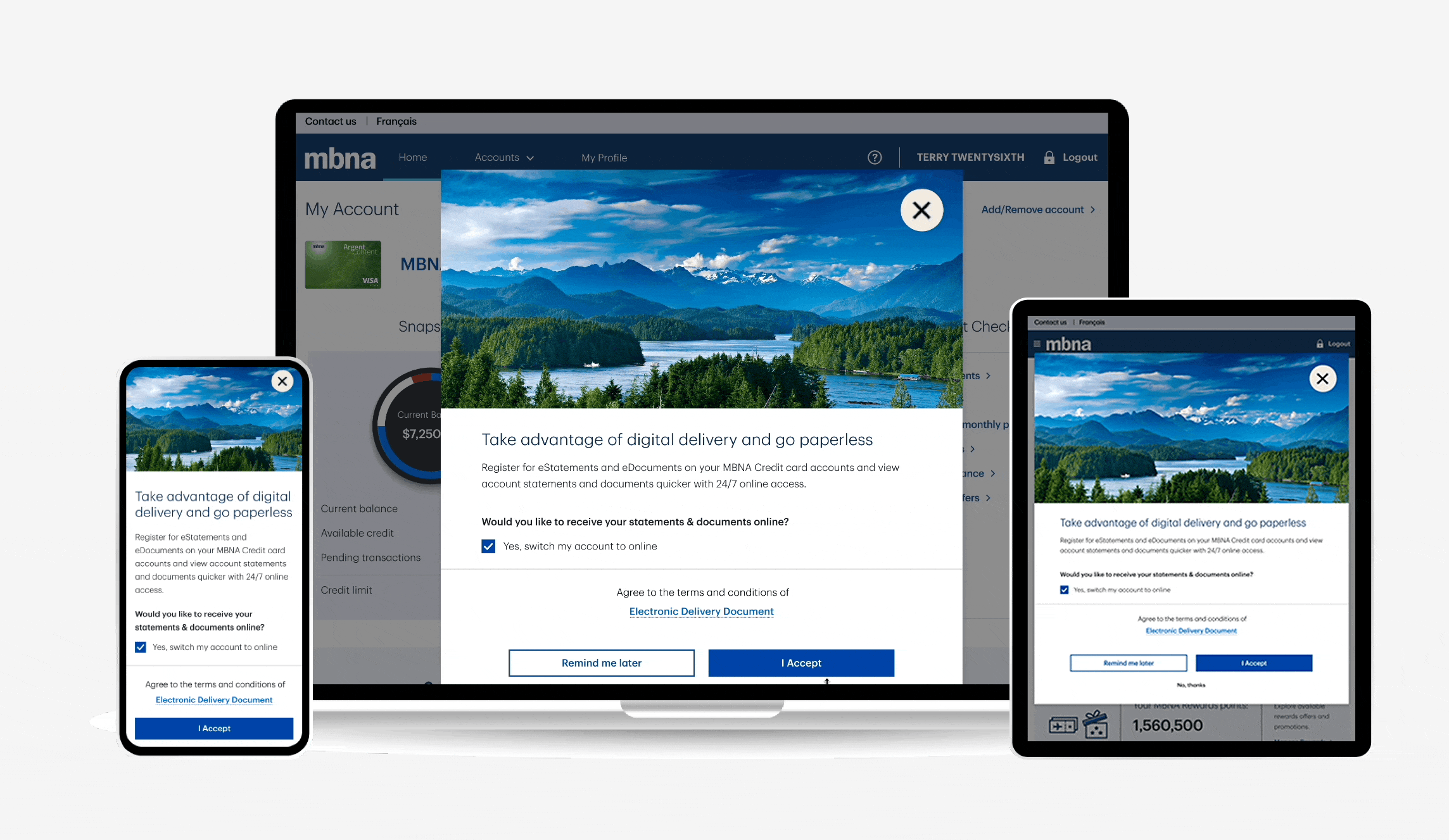
Digital Collateral
We introduced a seamless opt-in for e-statements and e-documents, making it easy for users to go paperless—supporting both convenience and MBNA’s move toward a more sustainable, digital-first approach.
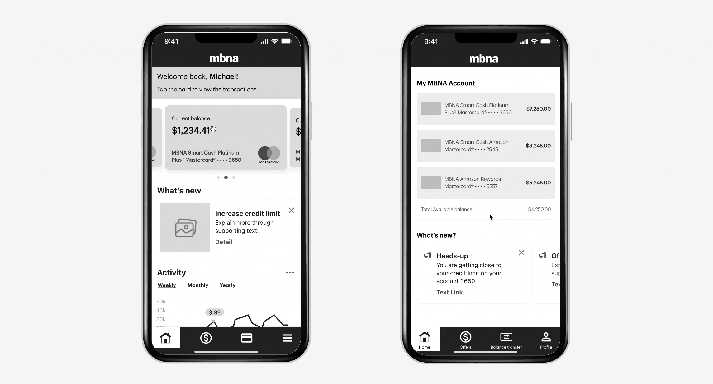
We developed exploratory wireframes to rethink the MBNA mobile credit card app, focusing on simplified architecture, quick account access, and streamlined interactions—all tailored for on-the-go banking. Guided by internal insights, we identified key opportunities to optimize the user journey, even without extensive research.
What are Fractional Shares?
Think of a stock like a whole pizza. With fractional shares, you don’t need to buy the whole thing—you can just get a slice. This makes it easier to start investing and diversify, even with a small amount of money.

Why Fractional Shares?
We looked at competitors like Wealthsimple, Robinhood, and Charles Schwab to learn how they positioned their offerings.
From this, we concluded three key benefits:
• Lower Barriers to Entry: Users can invest with as little as $1, making the market accessible to beginners.
• Fine‑Grained Portfolio Control: Experts can rebalance in precise increments, optimizing allocation without buying whole shares.
• Market differentiation – Unlike U.S.-focused platforms like Robinhood and Schwab, TD has the opportunity to lead in the Canadian market with a flexible, customer-first approach.
Understanding User Needs Through Concept Testing
We conducted 15 remote sessions across beginner, active, and long-term investors. Each session combined cognitive walkthroughs of mobile prototypes and interviews to validate demand and surface key usability insights.
This phase mapped to the Research and Evaluation stages of TD’s framework:
• Research: Uncovered latent needs (e.g., frustration with toggles).
• Evaluation: Prototype A’s success validated the hypothesis that fractional trading should be implicit, not a feature toggle.


Integrating Fractional Shares into Flows
Order Ticket
We added fractional share capabilities to both buy and sell workflows while maintaining WebBroker&Easy Trade's existing interface patterns.

Order Ticket to Order Status Flows
.png)
Order Ticket (Partial Wireframe Example)
Buy/Sell Flow Enhancements:
• Additional a new fractional trading feature on order tickets Market Buy/Sell
• Dollar-to-share auto conversion (up to 5 decimals) for smoother input
• Clear display of fractional quantities on the review screen
• Visual cue when a stock/ETF supports fractional shares
• Only available during market hours to align with execution rules
Buy Flow - Prototype (Webbroker)
Sell Flow - Prototype (Webbroker)

Edge Cases - Partial Example (Webbroker)

Order Ticket (Easy Trade)
Unified Improvements
• Consistent fractional formatting across all order flows
• No big changes to core trading workflows
The implementation delivered fractional trading functionality without disrupting familiar user behaviors, making it accessible while maintaining platform stability.
Entry Point & Onboarding Experience
The Challenge
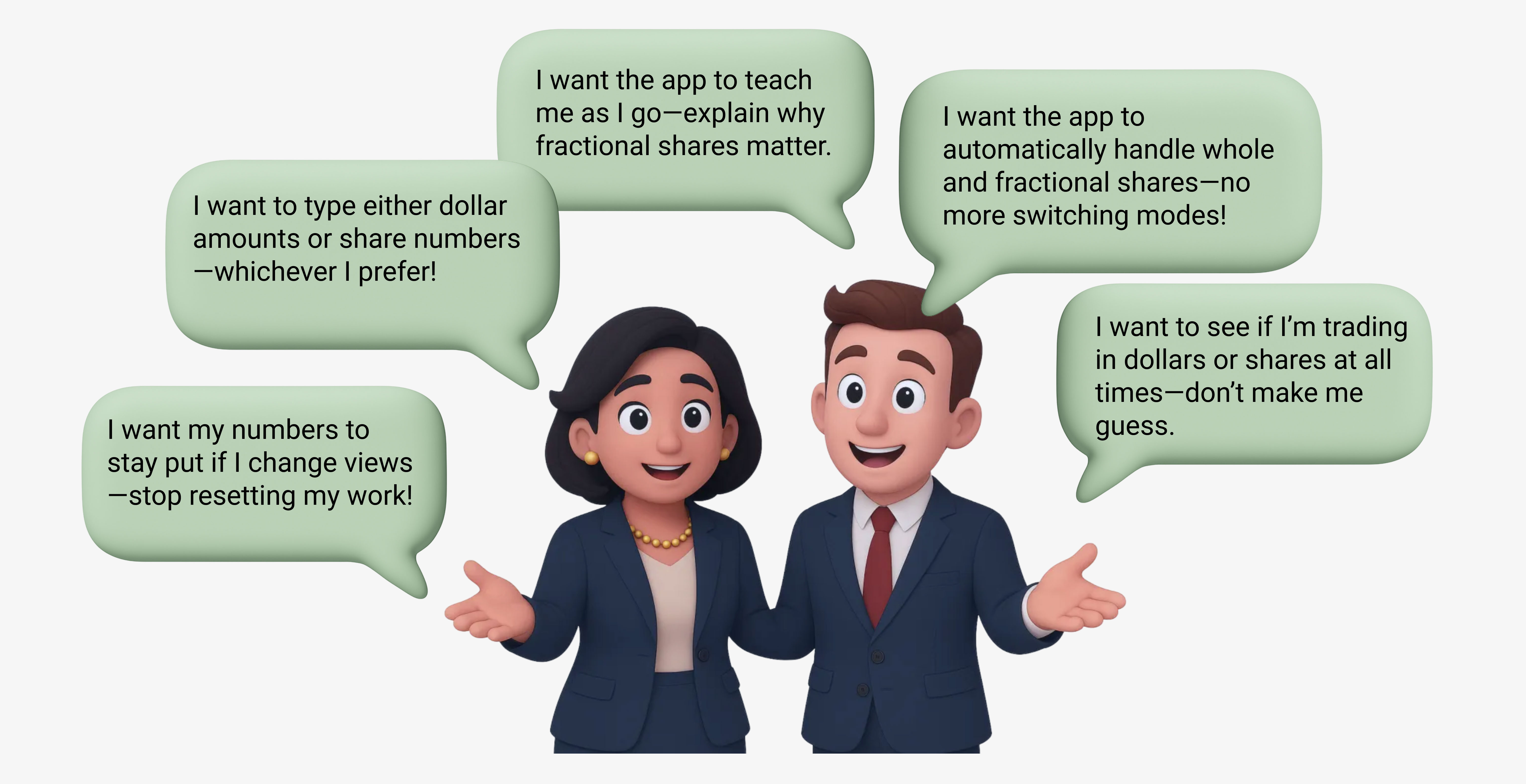
When designing the entry point and onboarding flow for fractional shares, we asked: How might we educate both beginners and experienced investors without overwhelming them? Through multiple rounds of iteration with our design lead and product manager, we aimed to balance clarity, discoverability, and user needs across different experience levels.
Solution
We designed a layered onboarding experience based on user familiarity:
• Beginners saw an educational page and tooltips that explained the benefits of fractional shares in context.
• Advanced users received light prompts like badges and coach marks, allowing them to explore at their own pace.
To improve discoverability, we added entry points across the homepage, order ticket, help center, and portfolio—making the feature easy to find throughout the journey.
1. What’s New" Page

Easy Trade - What's New

WebBroker - What's New
2. Just-in-Time Education (Dedicated Page)
Broke content into digestible chunks:
"What" (Definition with interactive pie charts)
"Why" (Benefits like "Buy Amazon for $10" with real stock examples)
"How" (Embedded videos/real life screenshot of the actual trade flow)

WebBroker - Educational Page
3. Guided Discovery (Coach Marks)
We implemented a time-sensitive, non-intrusive coaching system that balanced education with workflow preservation:
First-Launch Exclusive
• Coach marks appeared only once for post-launch
• Triggered exclusively on users' first visit to the order ticket after the feature release

Easy Trade - Coach Mark

Easy Trade - Portfolio
Handoff & Design Documentation
To ensure smooth implementation, we provided detailed design specs with annotations, covering functionality, interactions, and edge cases. Below is an example of how we handed off the fractional shares input field for development.


Results: Laying the Foundation for Accessible Fractional Trading
Although our team involved during the early stages of this project, our foundational work set the direction for a successful launch. Together with my team, I helped shape the core experience and user flows that made fractional investing more intuitive and inclusive:
• For Beginners: We designed early concepts that lowered the financial barriers to entry, and also provided clear, bite-sized fractional guidance with several accessible entry points.
• For Experts: We ensured the design supported advanced use cases like portfolio precision and control.
• For TD: This feature contributed to strengthening TD’s position in offering flexible, user-centric investing tools.
One thing I’m especially proud of—we also created a reusable coach mark component that was added to the design system. This not only supported this feature, but became a useful asset for cross-functional teams moving forward.


We repositioned the sustainable speaker brand by highlighting its eco-friendly features and sound quality. A unique brand proposition informed a cohesive visual identity, elevating the brand as a leader in sustainable consumer electronics.
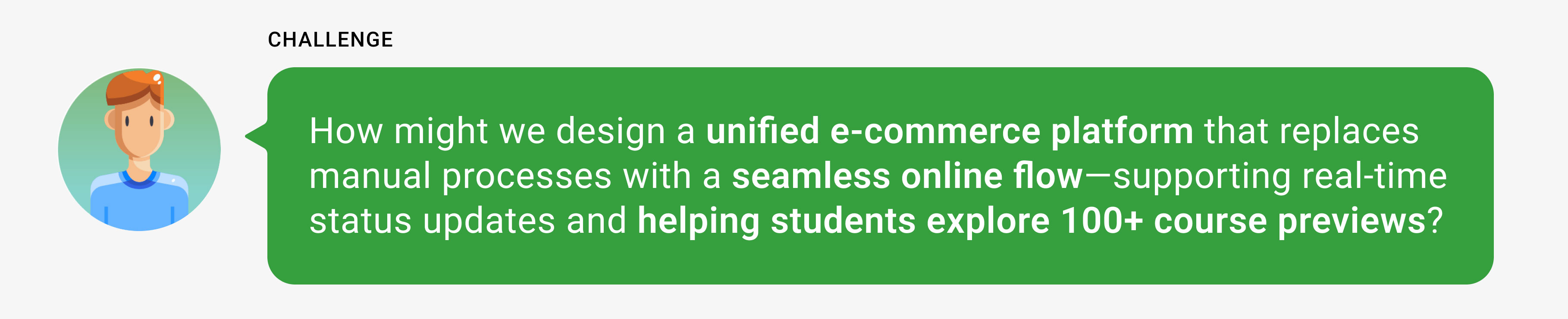
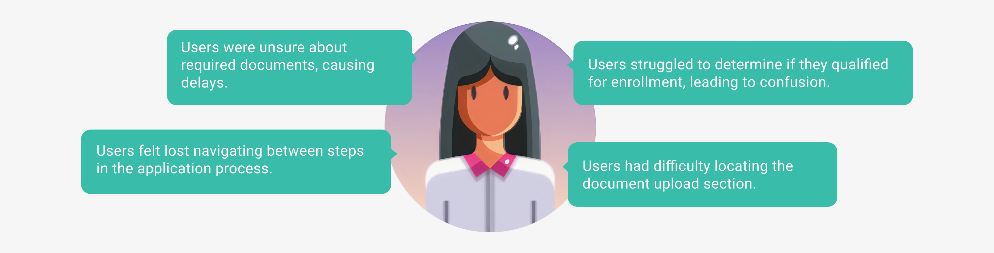
The old TVO ILC platform relied on manual processes—confusing application steps, limited course info, PDF forms to email, and phone payments—causing delays and user frustration. Without course previews or real-time updates, students struggled to choose courses and complete enrollment, leading to high support demand and drop-offs.
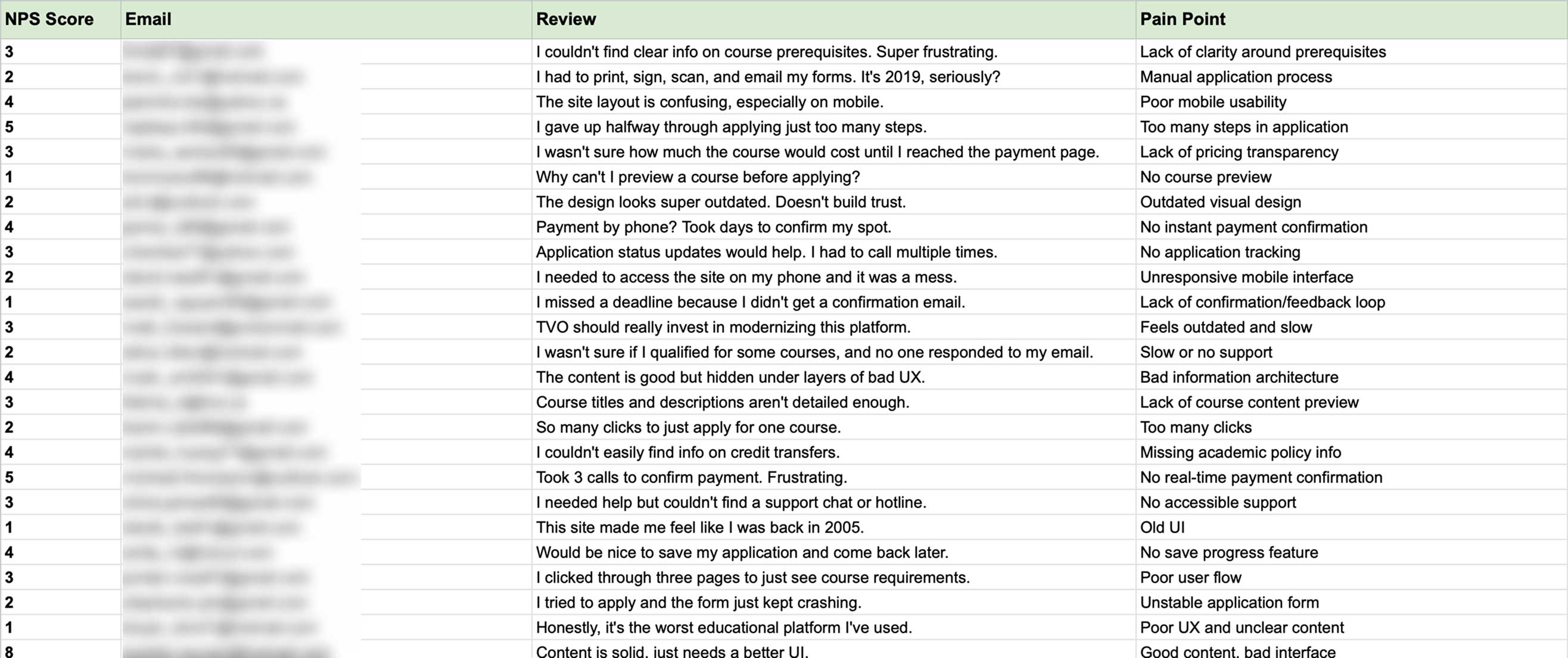
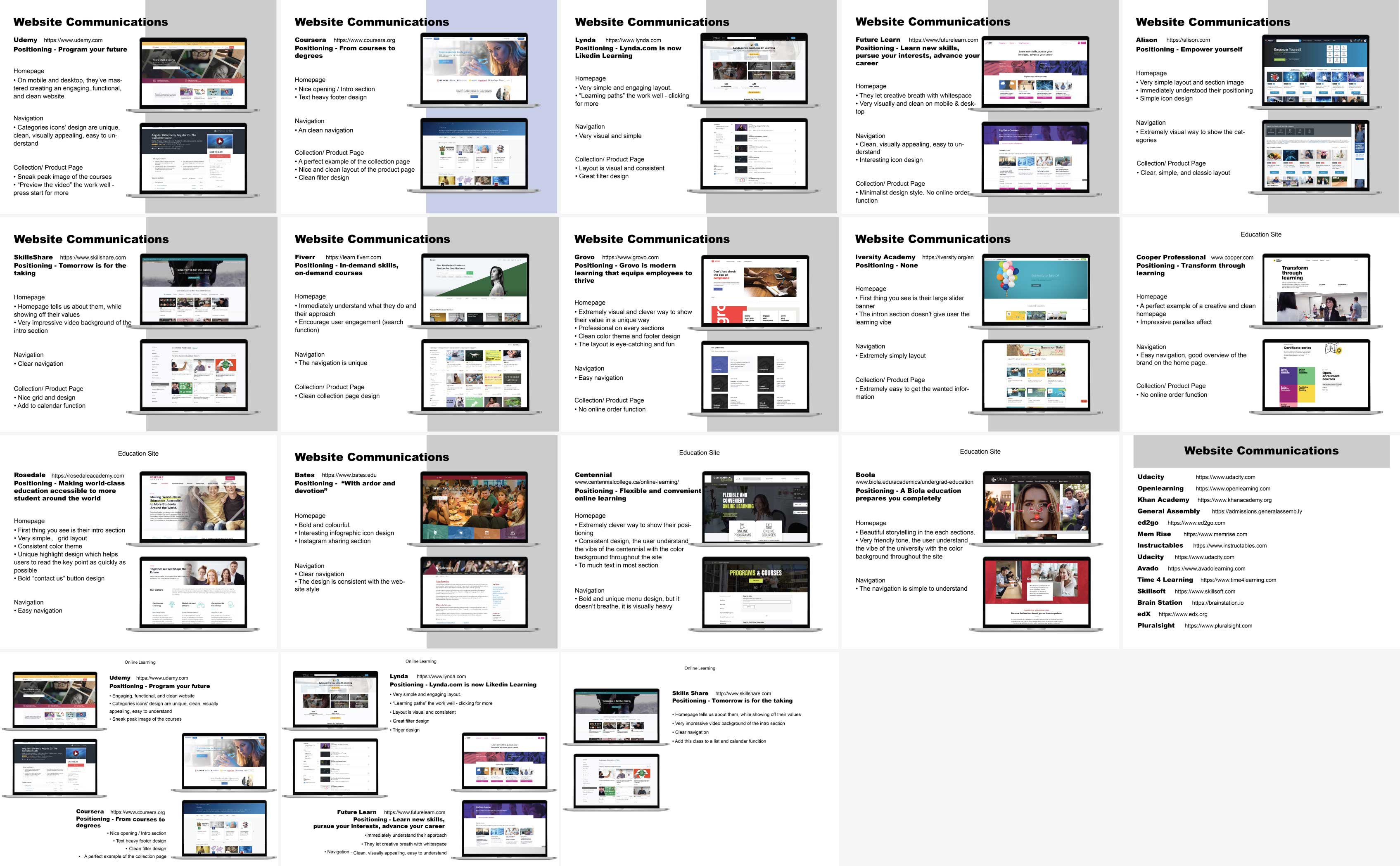
To tackle the TVO ILC’s pain points, we started by diving deep into the user experience. Through NPS reviews, stakeholder interviews, and competitive research, we mapped frustrations and identified gaps between TVO ILC and leading educational platforms.
Key insight: TVO ILC wasn’t just lagging behind competitors—it was falling short of basic user expectations. Students needed a modern, inclusive platform that prioritized simplicity, transparency, and flexibility, reflecting their real-world needs.

We created a user persona using insights from online research, student feedback, competitor analysis, and customer service conversations.
• Primary: High-school and adult learners (OSSD, international, homeschool, Indigenous communities)
• Secondary: Parents, tutors, guidance counselors

Design Takeaway:
By understanding the unique needs of each user, we tailored key moments—like course previews, eligibility checks, and application confirmation—to reduce friction and build trust across the board.
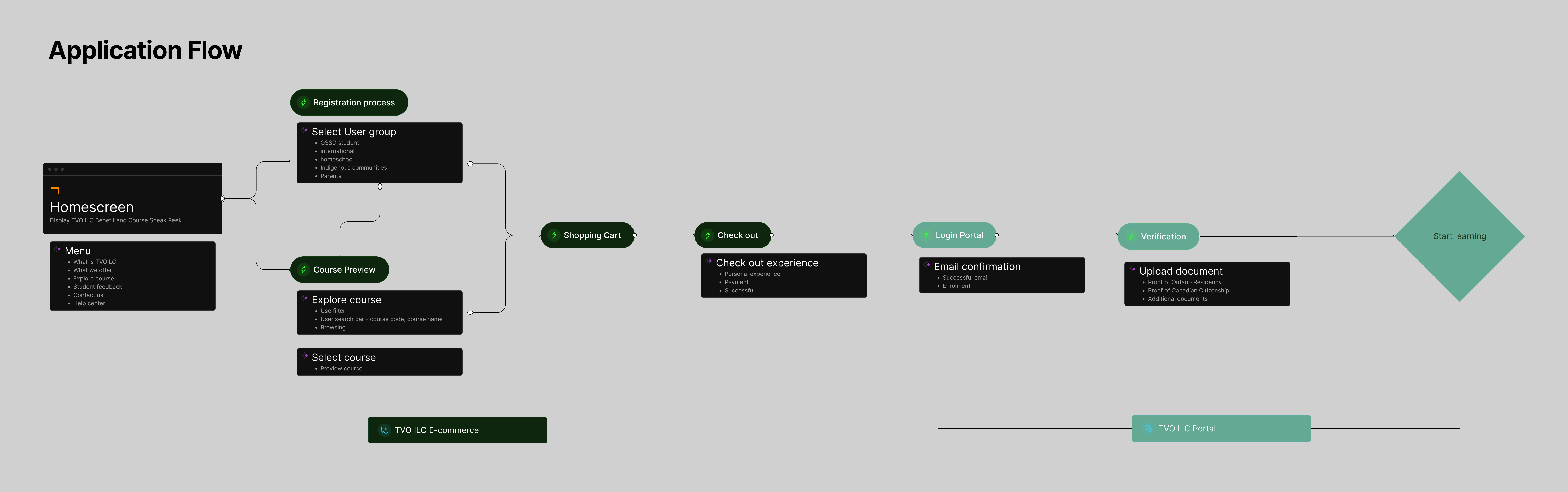
We rolled up our sleeves and mapped the entire student journey—from discovering TVO ILC to starting their first lesson—using sticker paper on a wall-sized canvas. This collaborative approach let us:
• Break down every step: Course discovery, enrollment, payment, and onboarding.
• Spot friction points: Where users got stuck (e.g., manual payment steps, unclear document uploads).
• Refine the flow: Simplify complexity and inject moments of clarity (e.g., progress trackers, instant payment confirmations).

To tackle the fragmented enrollment experience, we launched a collaborative sprint using the “Crazy 8” brainstorming method—sketching eight rapid ideas in eight minutes—to push creative boundaries.
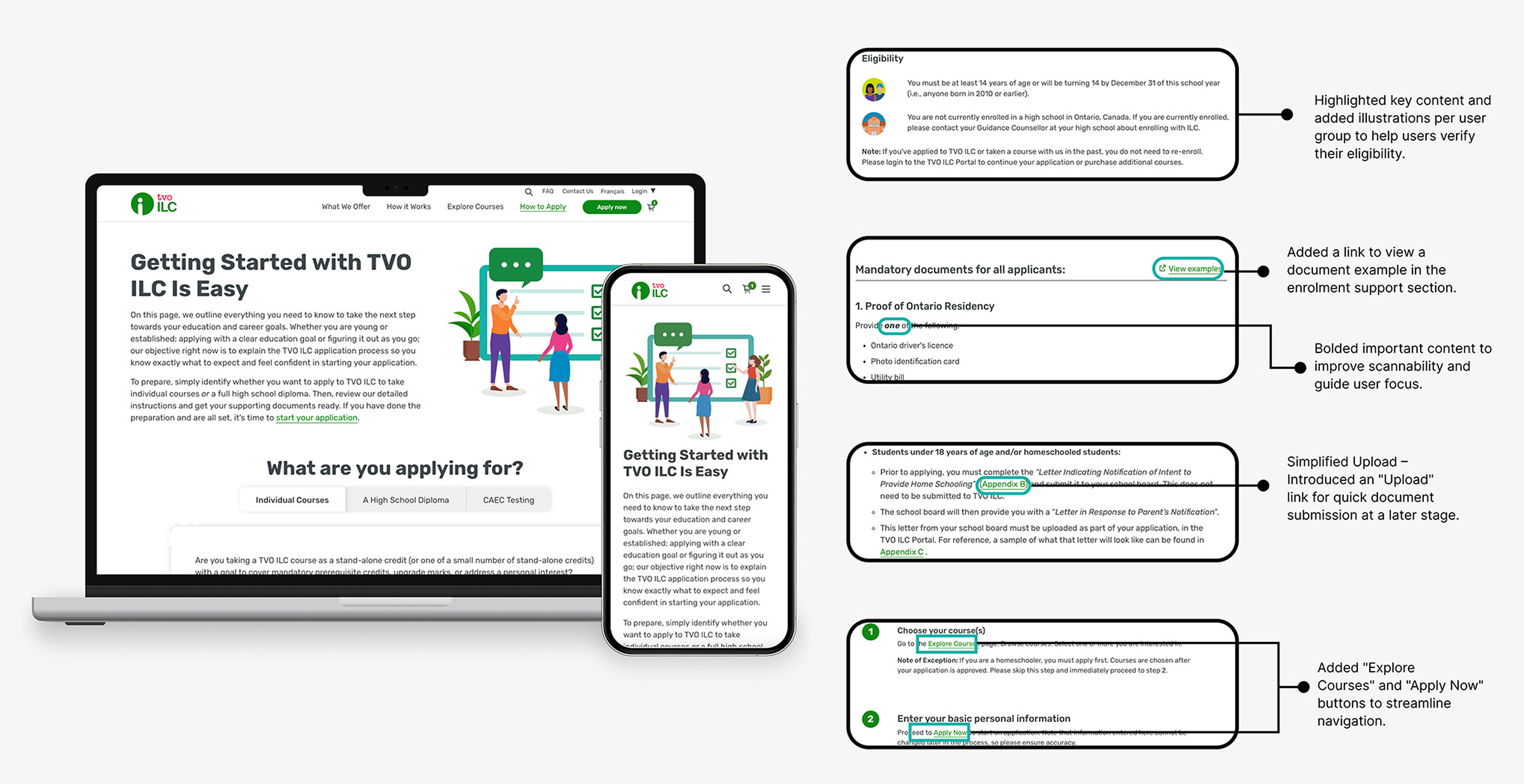
To fix the fragmented enrollment process, we focused on three fixes:
• Visual timelines eliminated confusion by showing users their current step and what’s next.
• Personalized checklists adapted to profiles (e.g., simplified docs for different user groups).
• Guided course selection used filters, previews, and skill-matching tools to speed up decisions.


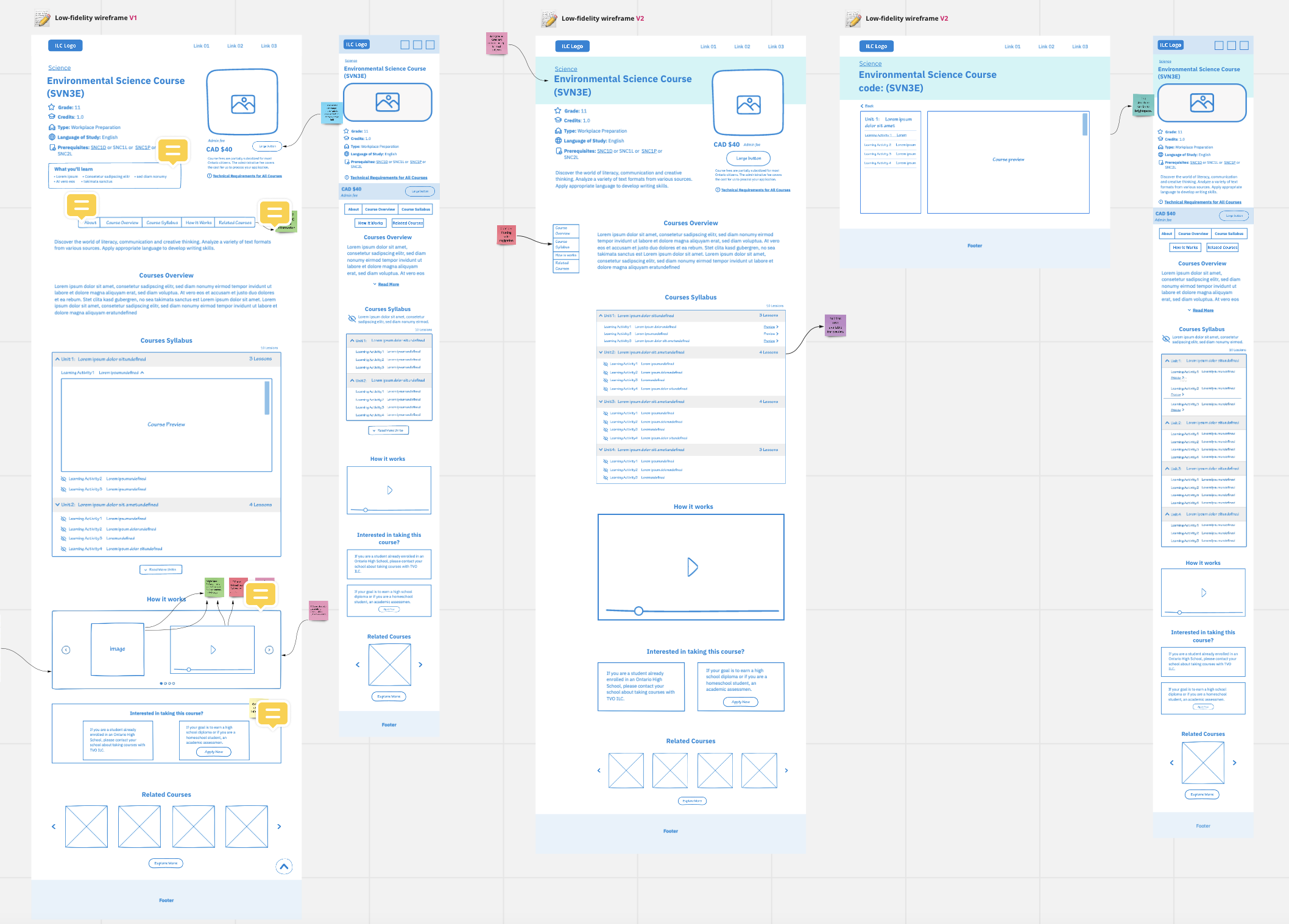
With core solutions defined, we translated ideas into low-fidelity wireframes, focusing on two critical journeys: engagement (discovering courses) and payment (completing enrollment).
Engagement-First Design:
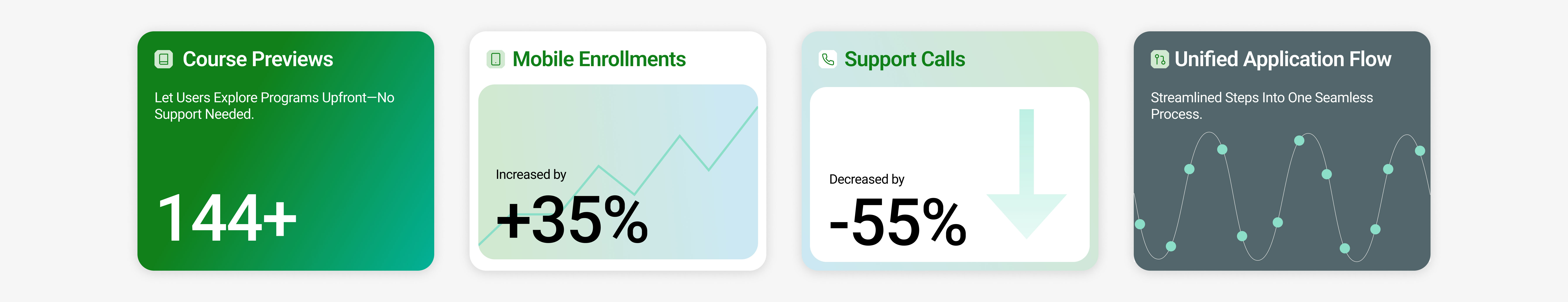
• Course discovery: Explored layouts (grid vs. list views) and tested filters (subject, grade, language) to prioritize clarity for users juggling 144+ courses.
• Personalized paths: Designed dynamic forms that adjusted requirements based on user type (e.g., graduated students saw simplified steps, high school students saw OSSD requirements).
Frictionless Payments:
• Transparent pricing: Integrated costs upfront and broke down fees (tuition, materials) to avoid surprises.
• Guided steps: Reduced payment screens with a progress tracker showing “You’re almost done!”

With our initial designs in place, we moved into a rigorous feedback loop—collaborating with stakeholders and users to ensure the design aligned with business goals and real-world needs.
Key Stakeholder Workshops:
• Presented the wires and prototype to stakeholders, educators, IT teams, and ministry reps.
• Maintained TVO’s educational tone while modernizing visuals (e.g., accessible typography, inclusive imagery).
• Technical feasibility: Audited payment API integration and legacy system limitations to ensure realistic timelines.
To validate our prototypes, we conducted 1:1 interviews with 8 students and deployed a task-based survey to 30+ users. Our goal: identify gaps in the enrollment flow and simplify complexity.
Survey Insights: 78% rated the new flow “simpler” than the old process.
In the visual design process for TVO ILC, I transform wireframes into interactive prototypes by integrating UI elements, real content, and user flows. I conduct usability testing and perform responsive design checks to gather user feedback and ensure consistency across devices.
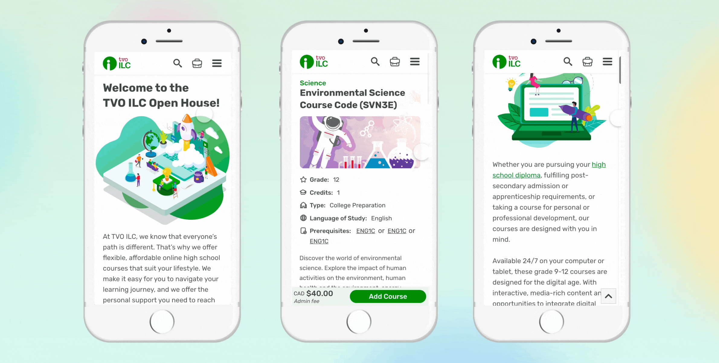
I took a mobile-first approach to ensure seamless usability across devices. On the course list page, for example, we simplified the course cards for mobile by removing images and using a distinct color-coded system for grade levels. This not only made the list more scannable but also reduced visual clutter, helping students find relevant courses faster.
To ensure consistency and scalability, I developed a custom design system tailored to TVO ILC’s unique needs. This system became the single source of truth for designers, developers, and stakeholders, streamlining workflows and reducing redundancy.

Subject-Based Gradient System
The gradient color system played a key role in building a cohesive and engaging visual identity across the platform. By assigning a unique gradient to each subject and applying it consistently—from subject icons and course covers to mobile views and detailed pages—I not only enhanced visual recognition but also created a more dynamic and organized learning environment. This thoughtful use of color helped users quickly associate content with specific subjects, reduced cognitive load, and added a layer of warmth and personality to the overall experience.

Animated Elements
I designed animated icons to highlight TVO ILC’s benefits on the homepage, showcasing flexible learning, accessibility, and self-paced courses. The smooth animations made the page more dynamic and engaging, helping users quickly grasp key features.

After launching the site, I conducted a comprehensive data analysis to assess user behavior and identify areas for improvement.
Using Hotjar, I closely examined user interactions through various analytics tools, including:
• Scroll Map – Tracked how far users scrolled to determine if key content was reaching them.
• Click Map – Analyzed which elements received the most clicks, particularly CTAs, to evaluate their effectiveness.
• Move Map – Observed cursor movements to understand navigation patterns and user focus areas.

I brought together a cross-functional team for a data-driven brainstorming session, using Hotjar insights to analyze how users interacted with the site—where they clicked, how far they scrolled, and which sections they ignored. Beyond analytics, we also gathered direct feedback through face-to-face surveys with students to understand their challenges firsthand. The tech team shared backend limitations, customer service highlighted common user frustrations, and stakeholders provided business priorities.

I compiled the heat map results, mapping findings page by page, section by section into a conclusion table to identify key patterns. I then passed this to the project manager, prioritizing high-impact improvements to enhance the user experience efficiently.

After prioritizing the conclusion table, I began developing low-fidelity wireframes to directly address the pain points identified during brainstorming.
• Improve CTA visibility: By making key "Add Course} buttons "sticky," we boosted user engagement and conversions.
• Enhance content hierarchy: We restructured how course details were presented, resulting in better comprehension and user engagement.
• Simplify the checkout flow: By reducing form fields and streamlining the payment process, we minimized drop-offs.
Retested after two month:
• Click Map Analysis“Add Course” CTA Performance:
Mobile: After relocating the CTA to a sticky footer” clicks increased by 35% in the first month.
• Scroll Map Insights
Homepage Engagement:
Below-the-Fold Content: After restructuring the layout to surface key actions (e.g., enrollment deadlines, course previews), 48% of users scrolled to the bottom of the page—up from just 24% pre-launch.

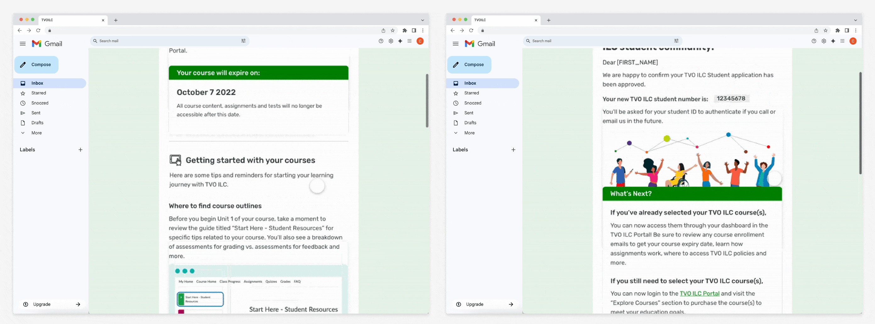
To ensure users feel confident and informed after enrollment, I designed a supporting email flow that complements the website experience. Instead of relying solely on the on-site confirmation screen, users receive:
• Enrollment Confirmation Email – reinforces successful registration.
• Course Start Guide Email – includes next steps, login info, and what to expect.
I worked with the marketing and engineering teams to align messaging, timing, and visual consistency with the brand.
This project showcased the power of product thinking—combining user empathy, data, and iterative design to build a scalable, impactful learning platform.